
Resize first, then choose your format, then compress, then serve responsively. That four-step sequence is the entire image optimisation workflow, and following it consistently will cut your page weight, improve your Core Web Vitals scores, and make your site noticeably faster for visitors on mobile.
Here is the short checklist you can apply right now:
- Resize every image to the largest display width it will ever appear at before you compress it. Never upload a 4,000px wide photo for a 600px column.
- Choose WebP as your default format for photographs and complex images. Use AVIF where encoding time allows. Keep PNG for logos and graphics with transparency. Use SVG for icons and illustrations.
- Compress photographs at quality ~80 for a good balance of file size and fidelity. Raise to ~85–90 for product shots with fine detail or text. Drop to ~60 for thumbnails. Always keep a lossless master file.
- Add
srcsetandsizesso the browser downloads the right variant for each screen. Addloading="lazy"to every image below the fold. - Sanity check: zoom in at 100% and compare the compressed version against the original. Then run PageSpeed Insights and confirm your Largest Contentful Paint (LCP) image loads in under 2.5 seconds.
Key takeaways
Optimising images for web is the single highest-impact performance improvement available to most small business site owners, and the core workflow is resize, choose format, compress, then serve responsively with srcset.
| Point | Details |
|---|---|
| Resize before compressing | Export at the maximum display width, never upload a full-resolution camera file directly. |
| WebP is your default format | WebP saves 25–35% over JPEG at similar quality and has near-universal browser support. |
| Quality 80 for photos | Set photographic exports to quality ~80; raise to ~85 for product shots with fine detail. |
| Add srcset and width/height | Srcset serves the right variant per device; width/height attributes prevent layout shift (CLS). |
| Ace-sites handles it for you | Ace-sites builds performance-ready sites with responsive images and built-in SEO tools included. |
Table of Contents
- Why does image optimisation matter for your website?
- A practical step-by-step workflow for optimising images
- Which file format should you use for web images?
- How does pixel density affect the sizes you should export?
- Lossless vs lossy compression: which settings actually work?
- How do srcset, sizes and the picture element work?
- Which tools should you use to compress and optimise images?
- Automation and developer options for larger sites
- How do you test and measure your image optimisation results?
- Privacy-conscious image optimisation: keeping files on your device
- A practical walkthrough: compressing a product photo without visible quality loss
- What small UK businesses usually get wrong with image optimisation
- Your website should handle the hard parts for you
- Sources
Why does image optimisation matter for your website?
Images are the single largest contributor to page weight on most websites. HTTP Archive data shows images are a dominant share of transferred bytes across the web, and separate performance research confirms that image payloads typically account for a significant portion of a page's total bytes. No other asset type comes close.
That matters for three reasons:
- LCP and Core Web Vitals. Google's ranking signals include page experience metrics. A slow-loading hero image directly delays LCP, which is the metric Google uses to measure how quickly the main content appears. Miss the 2.5-second threshold and you lose both rankings and visitors.
- Conversions and bounce rate. Faster pages keep people on your site. For a local service business, a visitor who bounces before your page loads is a lost enquiry.
- Bandwidth costs. If you are on a hosting plan with data transfer limits, or using a CDN that charges by egress, smaller images reduce your bill. For small businesses focused on fast, affordable websites, that saving adds up.
Optimising images is the highest-impact, lowest-effort performance improvement available to most site owners. Fix your images before you touch anything else.
A practical step-by-step workflow for optimising images
Order matters here. Compressing before resizing wastes effort because you are compressing pixels you will never display. Choosing a format before you know your target dimensions can mean picking the wrong encoder. Follow the steps in sequence.
- Resize to display dimensions. Decide the maximum pixel width the image will occupy on screen (for example, 1,200px for a full-width hero on desktop). Export at that width. For retina/HiDPI screens, also export a 2x version at 2,400px.
- Choose your format. Photographs go to WebP (or AVIF if your pipeline supports it). Logos and graphics with transparency stay as PNG or SVG. See the format guide below.
- Compress. Apply the quality setting appropriate to the content type. Strip EXIF metadata unless location data is intentional.
- Add responsive markup. Write
srcsetandsizesattributes so the browser picks the right file. Addloading="lazy"to below-the-fold images andfetchpriority="high"to your LCP image. - Test. Run Lighthouse or PageSpeed Insights. Check the image visually at 100% zoom before publishing.
Recommended export targets
| Content type | Max width (1x) | Suggested quality | Typical file size |
|---|---|---|---|
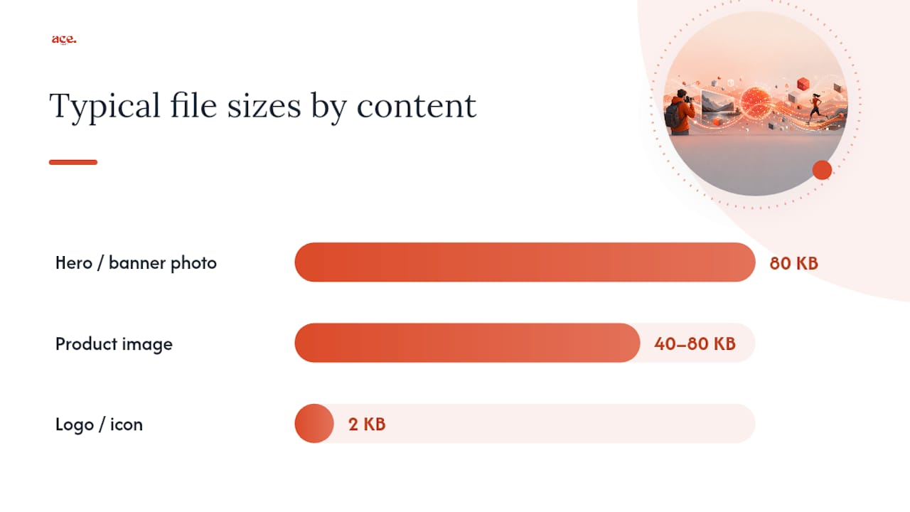
| Hero / banner photo | 1,200–1,600px | 80 (WebP) | 80 KB |
| Product image | 800px | 85 (WebP) | 40–80 KB |
| Thumbnail | 600px | 60 (WebP) | a moderate file size range |
| Logo / icon | Vector (SVG) | Lossless | 2 KB |
If you cannot spot a difference, the quality setting is right. If you can see blocking or colour banding, raise the quality by 5 and re-export.*
Which file format should you use for web images?
Choosing the right format is where many site owners lose unnecessary kilobytes. Adobe recommends 72 PPI as a baseline for web display and describes the lossless versus lossy trade-off clearly: lossy formats (JPEG, WebP, AVIF) discard some image data to achieve smaller files, while lossless formats (PNG, WebP lossless, GIF) preserve every pixel.
Here is when to use each:
- JPEG — photographs where you do not need transparency and browser compatibility is the priority. Widely supported, predictable quality, but larger than WebP at the same visual quality.
- WebP — the practical default for most photographs and complex graphics today. WebP typically yields notable savings compared to JPEG at similar perceived quality, with near-universal browser support.
- AVIF — the next step up. AVIF frequently saves 40–60% over JPEG, but encoding is slower and older browsers need a fallback. Worth using for high-traffic pages where bandwidth savings justify the build cost.
- PNG — logos, screenshots, graphics with text, and anything requiring a transparent background. Lossless by default, so file sizes are larger than JPEG for photographs. Never use PNG for full-colour photography.
- SVG — icons, illustrations, and any asset drawn with paths rather than pixels. Scales perfectly to any size, tiny file size, and fully styleable with CSS.
Format fallback pattern
Use the <picture> element to serve AVIF to browsers that support it, WebP as the middle tier, and JPEG as the universal fallback. This pattern gives modern browsers the smallest file while keeping older browsers functional.
| Asset type | Recommended format | Fallback |
|---|---|---|
| Photograph | WebP or AVIF | JPEG |
| Logo with transparency | SVG or PNG | PNG |
| Screenshot with text | PNG | WebP |
| Icon / illustration | SVG | PNG |
How does pixel density affect the sizes you should export?
Device pixel ratio (DPR) is the number of physical pixels a screen uses to display one CSS pixel.
The practical approach:
- Export a 1x version at the CSS display width (e.g., 600px for a 600px column).
- Export a 2x version at double that width (1,200px) for retina screens.
- For hero images that span the full viewport, a 1,600px 1x and a 2,400px 2x covers most devices without excessive file sizes.
- Use
srcsetwith width descriptors (600w,1200w) and let the browser pick based on the device's DPR and viewport width.
For mobile-friendly small business websites, getting this right means your images look sharp on an iPhone without serving a 3MB file to a desktop visitor on a slow connection.
Naming convention tip: Use descriptive, lowercase filenames with hyphens rather than underscores. product-red-mug-600w.webp tells both the browser and search engines what the image contains. Avoid IMG_4892.jpg.
Lossless vs lossy compression: which settings actually work?
Lossless compression removes redundant data without discarding any image information. The file gets smaller, but every pixel is preserved exactly. PNG and WebP lossless use this approach.
Lossy compression goes further. It analyses the image and discards detail the human eye is unlikely to notice, particularly in areas of smooth colour or subtle texture. JPEG and WebP lossy use this approach. The trade-off is that each re-save of a lossy file degrades it slightly, which is why keeping a lossless master is non-negotiable.
Practical quality settings:
- Photographs: quality 80 is the practical sweet spot. Adobe's export guidance recommends not compressing more than necessary and keeping a high-quality master while exporting JPEGs for general web use.
- Product images with fine detail or text overlays: quality 85–90 preserves sharpness where it matters.
- Thumbnails and preview images: quality 60 is acceptable. Visitors are not scrutinising these at full size.
Signs you have over-compressed: blocky patches in smooth areas (JPEG artefacts), colour banding in gradients, and blurring around high-contrast edges like text on a photo.
Pro Tip: Compress iteratively. The lowest setting where you cannot see degradation is your optimal export quality for that image.
How do srcset, sizes and the picture element work?
The srcset attribute on an <img> tag lists multiple image files and their widths. The sizes attribute tells the browser how wide the image will actually appear at different viewport widths. The browser combines those two pieces of information with the device's DPR to download the smallest file that will still look sharp.
A basic pattern works like this: list your image variants in srcset with their pixel widths (600w, 1200w), then describe the layout in sizes (for example, "100vw on mobile, 50vw on desktop"). The browser does the maths and picks the right file. You never need to serve a 1,200px image to a phone displaying it at 375px.
The <picture> element extends this by letting you specify different formats. Put your AVIF source first, WebP second, and JPEG last. Browsers work through the list and use the first format they support.
MDN documents the best practice of including intrinsic width and height attributes on every <img> element. These prevent Cumulative Layout Shift (CLS) by reserving the correct space before the image loads. Without them, the page jumps as images appear, which harms both user experience and your Core Web Vitals score.
Steps to implement responsive images correctly:
- Add
widthandheightattributes matching the image's intrinsic dimensions. - Write
srcsetwith at least two width variants (1x and 2x). - Write
sizesto describe the image's layout width at each breakpoint. - Add
loading="lazy"to every image below the fold. - Add
fetchpriority="high"to your LCP image (usually the hero).
Pro Tip: Never lazy-load your LCP image. The browser needs to start downloading it immediately. Lazy loading it delays the very metric Google measures most closely.
Which tools should you use to compress and optimise images?
The right tool depends on whether you are editing one image or processing hundreds. Here is a practical breakdown:
- Squoosh — a free, in-browser tool from Google. It processes images entirely on your device, so your files never leave your computer. Supports WebP, AVIF, MozJPEG, and PNG. Best for one-off edits and format conversion where privacy matters.
- TinyPNG — compresses PNG and JPEG files via an API or web interface. Offers a WordPress plugin for automatic compression on upload. Free for up to 500 compressions per month via the API; paid plans for higher volume.
- ImageCompressor — a straightforward web-based tool for quick batch compression of JPEG and PNG files. No account required. Useful for small batches when you need a fast result without installing software.
- ShortPixel — a cloud-based service with a WordPress plugin, a Figma plugin, and a developer API. Supports WebP and AVIF output, bulk processing, and CDN delivery. Well-suited to small business sites that need automated optimisation without a custom build pipeline.
- Adobe Photoshop — the industry standard for precise control. Use "Export As" (not "Save for Web") for modern format support including WebP. Gives you full control over quality sliders, metadata stripping, and progressive encoding. Best when you need to resize, retouch, and export in one workflow.
- GIMP — a free, open-source alternative to Photoshop. Handles JPEG, PNG, and WebP export. Less polished than Photoshop but capable for most small-business image tasks without a subscription cost.
For photographers managing a portfolio site, the best photographer website builders often include built-in image handling, but you will still get better results pre-optimising before upload.
Automation and developer options for larger sites
Manual compression works fine for a ten-page site. Once you are managing hundreds of product images or a busy blog, automation pays for itself quickly.

Image CDNs transform images on demand. You upload one high-resolution master; the CDN generates the right size, format, and quality for each request based on the device and browser. Cloudinary and Imgix are the two most widely used services. The cost is per transformation or per bandwidth, so it scales with traffic rather than requiring upfront processing.
Build-time processing uses tools like sharp (Node.js, built on libvips) or MozJPEG to generate all your srcset variants during your site build. You pay the CPU cost once at build time and serve static files. This suits static site generators and JAMstack setups well. AVIF encoding via sharp is slower than WebP but produces the smallest files.
WordPress plugins sit between manual and fully automated. ShortPixel, Imagify, and similar plugins compress images on upload and can bulk-process your existing media library. They offload the CPU work to a cloud API, which keeps your server fast. If you are choosing between website builder platforms, check whether image compression is handled automatically before adding a plugin layer.
For small sites with under 50 images, manual compression with Squoosh or TinyPNG is faster to set up than any pipeline. For a growing e-commerce or service site, a WordPress plugin or CDN transform is worth the small monthly cost.
How do you test and measure your image optimisation results?
Run Google Lighthouse from Chrome DevTools or via PageSpeed Insights. The "Opportunities" section flags oversized images, images without explicit dimensions, and images not using modern formats. Each recommendation shows the estimated byte saving.
Key metrics to watch:
- LCP — should be under 2.5 seconds. If your LCP element is an image, its file size and delivery method are the primary levers.
- CLS — should be under 0.1. Missing
widthandheightattributes are the most common cause of layout shift from images. - Total image bytes — visible in the Network tab filtered to "Img". Compare before and after your optimisation pass.
Pro Tip: Run PageSpeed Insights on your live URL before and after deploying changes. Screenshot both results. The before/after comparison is the clearest way to confirm your optimisation actually worked and to spot any regressions introduced by new images.
WebPageTest gives a more detailed waterfall view and lets you test from UK-based servers, which is more representative for a UK audience than testing from a US data centre.
Privacy-conscious image optimisation: keeping files on your device
When you upload images to a cloud compression service, those files pass through a third-party server. For most website images that is fine. For staff photos, proprietary product shots, or any image containing personal data, you may prefer to keep processing local.
Tools that process images entirely on your device:
- Squoosh — all encoding happens in your browser via WebAssembly. Nothing is sent to any server.
- GIMP — fully local, open-source, no network connection required.
- Adobe Photoshop — local processing; cloud sync is optional and can be disabled.
- ImageMagick — command-line tool for local batch processing. Powerful but requires some technical comfort.
EXIF data checklist before publishing any image:
- Strip GPS coordinates from photos taken on a smartphone. Most compression tools do this automatically, but verify with a tool like ExifTool.
- Remove camera serial numbers and shooting dates from product or staff photos if that information is commercially sensitive.
- Check your site's privacy practices to confirm how uploaded images are stored and processed.
A practical walkthrough: compressing a product photo without visible quality loss
Here is a realistic example of the full workflow applied to a single product image.
Starting point: a JPEG exported from a smartphone at 4,032 × 3,024px, 4.2 MB.
Step 1 — Resize. The product image will display at a maximum of 800px wide on the site.
Step 2 — Format selection. The product has a white background and fine label text. WebP lossy at quality 85 is the right choice. AVIF would save more bytes but the encoding time is not justified for a single image edited manually.
Step 3 — Compress. Export the 800px version at WebP quality 85. Typical result: 45–65 KB, down from 4.2 MB. Export the 1,600px version at quality 85: approximately 120–160 KB.
Compare label text sharpness and background smoothness against the original. No visible artefacts at quality 85 for this content type.
Step 5 — Responsive markup. Add both variants to srcset with 800w and 1600w descriptors. Set sizes to reflect the layout (for example, (max-width: 800px) 100vw, 800px). Add width="800" height="800" attributes to prevent CLS.
Result: the page now serves a 45 KB file to mobile visitors instead of a 4.2 MB original. LCP for that page drops measurably. The visual quality is indistinguishable from the original at normal viewing distances.
What small UK businesses usually get wrong with image optimisation
The most common mistake is uploading images straight from a phone or camera without resizing. A 12-megapixel smartphone photo is typically 3–5 MB and several thousand pixels wide. Serving that to a visitor whose phone displays it at 400px is wasteful in every direction: bandwidth, load time, and LCP score.
The second most common mistake is using PNG for photography. PNG is lossless, which sounds appealing, but a full-colour photograph in PNG format is often three to five times larger than the same image in WebP at quality 80. PNG belongs on logos and graphics, not photos.
A few other patterns worth avoiding:
- Lazy-loading the hero image. The hero is almost always the LCP element. Lazy loading it tells the browser to wait before downloading the most important image on the page.
- Missing
srcsetentirely. Serving one large image to all devices is the single biggest missed saving on most small business sites. - Skipping the visual check after compression. Quality 60 looks fine in a thumbnail preview and terrible at full size.
Priority order for time-poor owners: run one Lighthouse audit, fix your hero image first (resize, convert to WebP, add fetchpriority="high"), then work through product images, then automate the rest with a plugin or CDN. For a beautician or salon site where product and portfolio images dominate the page, this single pass can transform load times.
Your website should handle the hard parts for you
Knowing the theory is useful. Having a platform that applies it automatically is better. Ace-sites builds performance-ready websites for small UK businesses with responsive images, lazy loading, and built-in SEO tools already in place, so you are not manually running compression workflows every time you add a new photo.

The Ace-sites platform includes mobile-optimised templates, an SSL certificate, and a blog manager, all without needing a developer or an agency retainer. If you would rather hand the whole thing over, the done-for-you build service sets up your site with image best practice baked in from day one. See what is included and start your free build today at Ace-sites.
Sources
- Webvitals
- Image Optimization for the Web: Formats, Compression, and Performance | UseToolSuite
- Almanac