
A mobile-friendly website loads quickly, displays clearly, and lets visitors complete their main task without pinching, zooming, or squinting. If your site ticks those three boxes on a phone, you are in good shape. If it does not, you are likely losing customers before they have even read your first sentence.
Run these three checks right now:
- Viewport tag — open your site on a phone. If you have to zoom out to see the full page, the viewport meta tag is probably missing.
- Primary action visible — can a visitor see your phone number, booking button, or contact form without scrolling? If not, it needs to move up.
- No horizontal scrolling — swipe sideways. If the page slides left or right, something is breaking the layout.
TL;DR — act now:
- Run your URL through Google Mobile-Friendly Test (free, takes 30 seconds).
- Check your speed score in Google PageSpeed Insights — aim for 75+ on mobile.
- Use Lighthouse in Chrome DevTools for a deeper audit.
- If you want a site that is already built for mobile, Ace-sites has a done-for-you option that goes live in under a day.
Table of Contents
- Why does mobile-friendliness matter for UK small businesses?
- What does a mobile-friendly website actually need?
- How do you check if your site is mobile-friendly?
- How do you make your site mobile-friendly: options and costs
- What should you prioritise after going mobile-friendly?
- Accessibility on mobile devices
- Key takeaways
- The case for mobile-first from the start
- Ace-sites gets your mobile-friendly site live fast
- Useful sources and tools
Why does mobile-friendliness matter for UK small businesses?
Mobile accounted for 58.5% of global web traffic in 2025. For most small UK businesses, that means the majority of people visiting your site are doing so on a phone, often while they are out and about looking for a local service.
Google uses mobile-first indexing, which means it crawls and ranks your site based on the mobile version, not the desktop one. A site that looks fine on a laptop but breaks on a phone will rank lower, receive fewer clicks, and convert less.
Speed is a big part of this. A site that loads in one second can convert at roughly three times the rate of one that takes five seconds. For a local plumber, beautician, or personal trainer, that difference is the gap between a new booking and a lost lead.
Local SEO is where mobile really earns its keep. When someone searches "electrician near me" on their phone, Google serves results based on proximity, relevance, and site quality. A properly built mobile site with a visible phone number and a clear call to action makes it easy for that person to tap and call you directly.
| Metric | Figure |
|---|---|
| Mobile share of global web traffic | 58.5% (2025) |
| Conversion rate multiplier (1s vs 5s load) | ~3× |
What does a mobile-friendly website actually need?
Responsive web design is the recommended approach. It uses a single codebase that adapts your layout to any screen size, keeps one URL per page, and avoids the maintenance headache of running a separate mobile site. Google recommends responsive design over other approaches for exactly this reason.
Here is what a properly built responsive site includes:
- Viewport meta tag —
<meta name="viewport" content="width=device-width, initial-scale=1">tells the browser to match the screen width rather than creating a wider virtual canvas that forces pinch-to-zoom. This is the single fastest fix if your site currently looks shrunken on a phone. - Readable text — body text should be at least 16px. Anything smaller and visitors will zoom in, which breaks the layout.
- Touch targets — buttons and links need a minimum tappable area of 48×48 CSS pixels with enough spacing between them to prevent accidental taps.
- Simple navigation — a hamburger menu or a short, thumb-friendly nav bar works far better than a multi-column desktop menu crammed onto a small screen.
- Optimised images — compress images before uploading and use modern formats like WebP. Uncompressed images are one of the most common reasons for slow mobile load times.
- Lazy loading — load images only when they scroll into view rather than all at once. This cuts initial load time noticeably.
- Accessible forms — use the correct HTML input types (
tel,email,number) so mobile keyboards switch automatically to the right layout.
Pro Tip: Design your mobile layout around one primary action. If you want visitors to call you, that button should be the first thing they see. Everything else is secondary.

How do you check if your site is mobile-friendly?
There are four tools worth using, and they each check different things.
| Tool | What it checks | Best for |
|---|---|---|
| Google Mobile-Friendly Test | Viewport, text size, tap targets | Quick pass/fail check |
| PageSpeed Insights / Lighthouse | Speed, performance, accessibility, SEO | Detailed scoring and fixes |
| Browser DevTools emulator | Layout at different screen sizes | Quick visual previews |
| SE Ranking mobile checker | Viewport, legibility, tap spacing | Automated audit with specific failures listed |
Automated tools check viewport configuration, tap target spacing, text legibility, and page speed — but they report pass/fail results. A pass means you have cleared the baseline. It does not mean your site converts well.
Run these manual checks on a real phone after the automated tests:
- Load your homepage on your own phone and time how long it takes.
- Tap every button and link. Do any require a precise tap to hit?
- Open your main menu. Can you navigate with your thumb without stretching?
- Fill in your contact form. Does the keyboard switch to a number pad for the phone field?
- Check your phone number. Does tapping it open the dialler?
Browser-based device simulators are handy for quick previews during a redesign, but they do not replicate the real-world experience of a slower mobile connection or a slightly older handset. Always test on a real device before you call a job done.
How do you make your site mobile-friendly: options and costs
There are four realistic paths for a small UK business owner. Which one suits you depends on your budget, your technical confidence, and how quickly you need results.
| Approach | Typical timeline | Rough cost |
|---|---|---|
| DIY fixes (viewport, images, buttons) | A few hours | Free to minimal |
| Responsive CMS theme swap | 1–3 days | — |
| Full developer rebuild | 2–6 weeks | — |
| Ace-sites done-for-you | Under 1 day | Low monthly subscription |
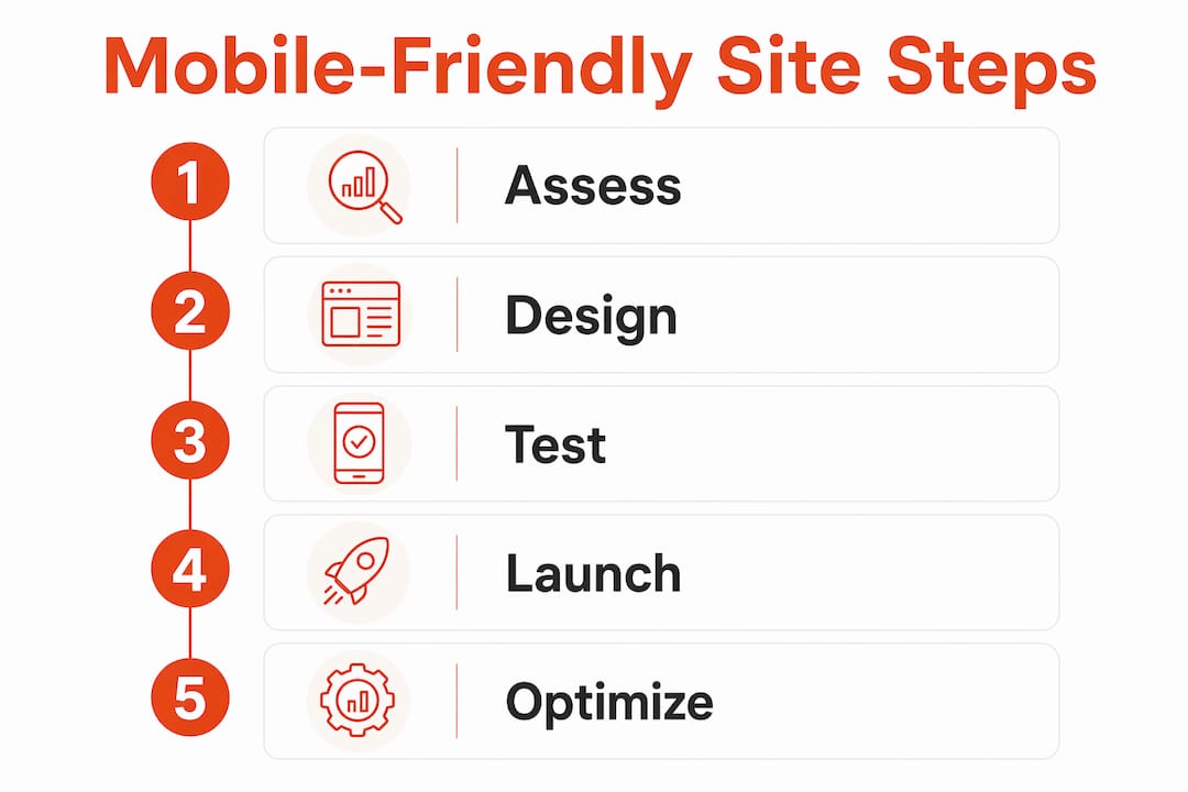
Follow this roadmap in order:
- Audit — run Google Mobile-Friendly Test and PageSpeed Insights. Note every failure.
- Add the viewport tag — if it is missing, this is your first fix. It takes two minutes and often resolves the most obvious layout problems immediately.
- Compress images — use a tool like Squoosh or TinyPNG to reduce file sizes before re-uploading.
- Fix tap targets — increase button sizes and add padding between links.
- Swap or update your theme — if you are on WordPress or a similar CMS, a modern responsive theme resolves most layout issues without a full rebuild. Pair this with advice on page speed for small businesses to get the most from the change.
- Test and iterate — re-run PageSpeed Insights after each change. Track your mobile score over time.
If the DIY route feels like too much, or your current site is too outdated to fix cheaply, a full rebuild or a platform like Ace-sites is the more practical option. For service businesses that need a low-maintenance website they can update themselves, a site builder with mobile-optimised templates is often the fastest and most cost-effective route.
For bespoke development needs beyond a site builder, Cannatract's web development services are worth a look if you need a custom build.

What should you prioritise after going mobile-friendly?
Mobile-first is a prioritisation strategy: identify the one thing you want a mobile visitor to do — call, book, or buy — and make it the first visible element on the page. Everything else supports that action.
Once your site is live, track these KPIs in Google Analytics or Search Console:
- Mobile sessions — are you getting traffic from phones?
- Bounce rate on mobile — a high rate often signals a slow load or a confusing layout.
- Mobile conversion rate — how many phone visitors complete your primary action?
- First Contentful Paint (FCP) and Largest Contentful Paint (LCP) — both are reported in Lighthouse and PageSpeed Insights. LCP should be under 2.5 seconds for a good score.
Pro Tip: Run a simple A/B check by moving your call-to-action button higher on the page for two weeks and comparing conversion rates before and after. You do not need specialist software — Google Analytics goal tracking is enough.
| KPI | Target |
|---|---|
| Largest Contentful Paint (LCP) | Under 2.5 seconds |
| Mobile conversion rate | Track weekly; improve monthly |
Accessibility on mobile devices
Accessibility and mobile-friendliness overlap more than most people realise. A site that is hard to use for someone with a visual impairment or motor difficulty is usually also hard to use for anyone on a small screen.
The practical fixes are straightforward. Use sufficient colour contrast between text and background — the Web Content Accessibility Guidelines (WCAG) recommend a minimum ratio of 4.5:1 for normal text. Label every form field clearly so screen readers can interpret them. Make sure interactive elements are reachable by keyboard or switch access, not just by touch.
Font size matters here too. Text set below 16px is not just uncomfortable for older users — it actively fails accessibility standards on mobile. Headings should follow a logical hierarchy (H1, then H2, then H3) so assistive technology can navigate the page structure.
Images need descriptive alt text. This helps screen reader users understand what an image shows, and it also gives search engines more context about your content.
One often-overlooked point: auto-playing video or audio on mobile is disruptive for users with hearing aids or cognitive differences. Keep media off by default and let visitors choose to play it.
Key takeaways
A mobile-friendly website is the baseline for any UK small business that wants to be found, trusted, and contacted online — and the viewport meta tag plus a visible primary action are the two fastest fixes to make today.
| Point | Details |
|---|---|
| Run the quick checks first | Use Google Mobile-Friendly Test and PageSpeed Insights before making any changes. |
| Fix the viewport tag immediately | Adding the standard viewport meta tag is the fastest single fix to stop layout breakage on phones. |
| Compress images and fix tap targets | These two changes improve both speed and usability with minimal technical effort. |
| Test on a real device | Automated tools flag baseline issues; a real phone reveals what actually frustrates visitors. |
| Ace-sites done-for-you | For a fast, low-effort route to a mobile-ready site, Ace-sites builds and launches your site in under a day. |
The case for mobile-first from the start
There is a common misconception that making a site "mobile-friendly" means shrinking a desktop layout until it fits a phone screen. That approach almost always produces a cluttered, slow, frustrating experience. The sites that actually convert on mobile are the ones built with the phone in mind first, where the desktop version is the expanded version rather than the original.
For small UK businesses, this matters more than it does for large brands. A national retailer can absorb a poor mobile experience because brand recognition carries some visitors through. A local plumber or a sole-trader beautician cannot. If your site is slow or confusing on a phone, that visitor will tap back and call your competitor instead.
The other thing worth saying plainly: a separate mobile site (a subdomain like m.yoursite.co.uk) is not the answer. It doubles your maintenance workload, can create duplicate content issues for SEO, and often lags behind the main site when updates are made. Responsive design, built into a single site, is the right approach for almost every small business.
Ace-sites gets your mobile-friendly site live fast
Most small business owners do not want to spend days learning CSS or hunting for the right WordPress plugin. Ace-sites is built for exactly that situation: you get a professionally designed, mobile-optimised website without needing any technical knowledge.
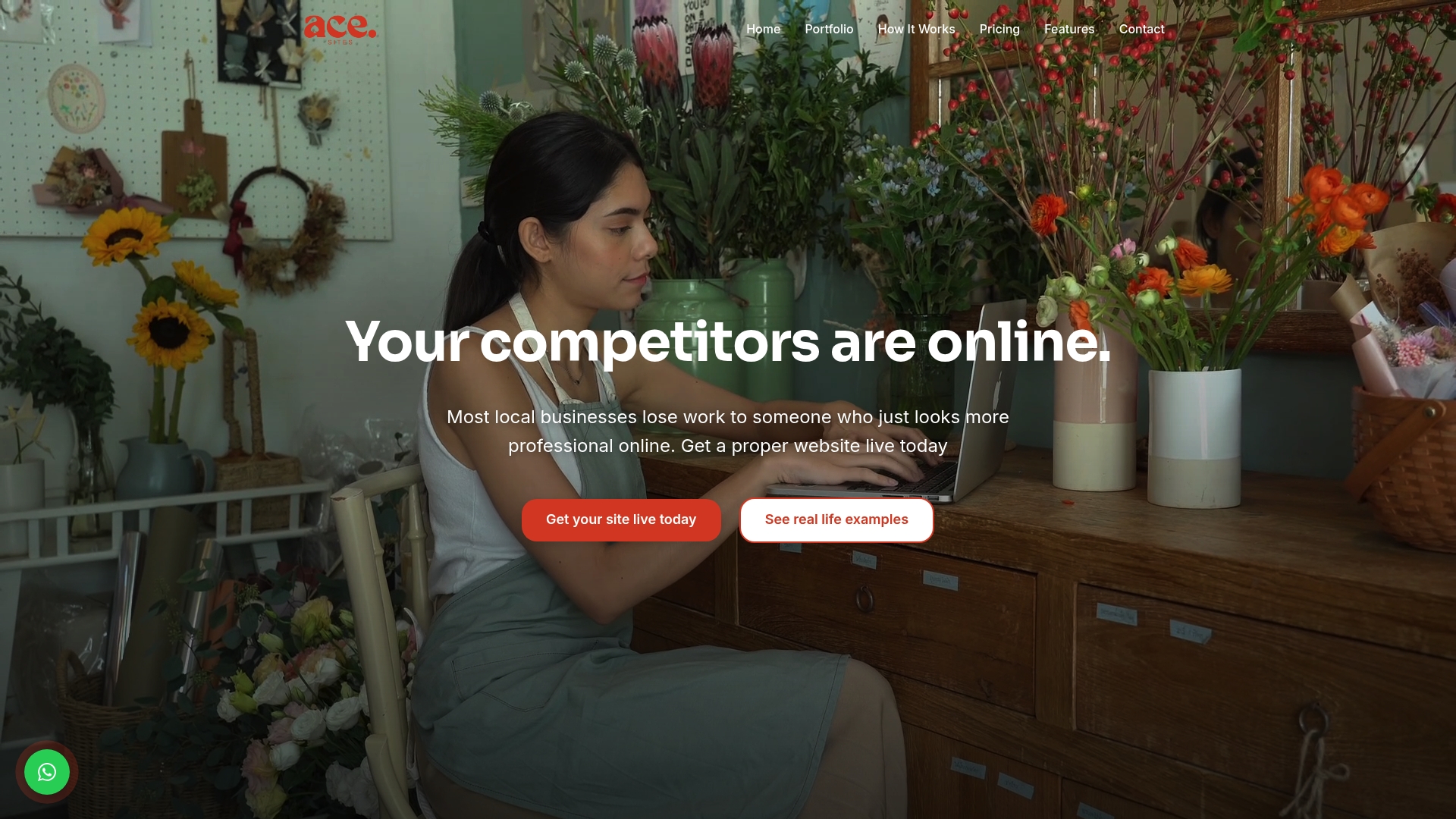
Every Ace-sites template is responsive from the start, with built-in SEO tools, an SSL certificate, a contact form, and a visual editor you can use yourself. The done-for-you option means Ace-sites builds the site for you — you pay nothing until you have seen it and approved it. Most sites go live in under a day.
What you get with Ace-sites:
- Mobile-optimised templates designed for service businesses
- Built-in SEO tools and blog manager
- SSL certificate included
- Contact forms and booking widget embeds
- Visual editor — no coding needed
- Optional done-for-you build at no upfront cost
If you would rather skip the DIY process entirely, see how the done-for-you service works and get your site built and live without the hassle.
Useful sources and tools
- Google Mobile-Friendly Test — the quickest way to get a pass/fail result on your current site.
- Google PageSpeed Insights — shows your mobile speed score and lists specific improvements to make.
- Lighthouse (Chrome DevTools) — a deeper audit covering performance, accessibility, and SEO; run it directly in your browser.
- SE Ranking mobile checker — useful for checking viewport configuration, tap target spacing, and text legibility in one report.
- MDN: Responsive web design — the authoritative technical reference if you want to understand how responsive CSS and media queries work.
- 1Byte: How to make a website mobile-friendly — a practical walkthrough covering the viewport tag, image optimisation, and mobile-first thinking.