
A website colour palette is the small set of colours (usually five to seven) that a site uses consistently for backgrounds, text, buttons and highlights. Start with the 60/30/10 rule: 60% neutral base, 30% secondary tone, 10% accent for calls to action. Once you've got that ratio sorted, run it through a generator or extractor, then check contrast before you write a line of code.
TL;DR:
- Use color tools that generate or extract palettes to ensure harmony and consistency aligned with the 60/30/10 rule.
- Attach each color to a specific UI role, such as primary, secondary, accent, or semantic, and build a tonal scale before adding new hues.
- Conduct contrast, color-blindness, and accessibility checks, especially for text and background pairings, to meet WCAG and APCA standards.
- Export palettes in formats suitable for development, like CSS variables, Tailwind configs, or JSON tokens, and test them on real pages and devices.
- Favor muted, earthy tones for wellness and sustainability brands, while using bolder accents for energetic, youth-oriented sites, matching audience preferences.
Table of Contents
- Tools that build or lift a palette for you
- Turn 60/30/10 into named colour roles
- The contrast checks a palette must pass
- From swatches to code: exporting a palette that developers will use
- Palette trends worth borrowing in 2026
- The handover checklist before anything goes live
- What colour actually does to a visitor's brain
- Colour means different things to different audiences
- Testing a palette on real people before you commit
- Gabbi's practical notes from real projects
- Get a live site with a working palette, faster
- Essential links for building your palette
- Sources
Tools that build or lift a palette for you
You don't need to invent colours from nothing. Most designers start with a generator, an extractor, or a gallery of ready-made sets, and each does a different job.
Generators let you build a palette from scratch. Look for harmony modes (complementary, analogous, triadic), the ability to lock a swatch while you experiment with the rest, HSL sliders for fine control, and export buttons for CSS, Tailwind or JSON. Coolors is the fastest for this: hit the space bar to shuffle, lock what you like, export in seconds. Huebert works similarly but leans harder into simple, shareable palette links, which suits quick client discussions.
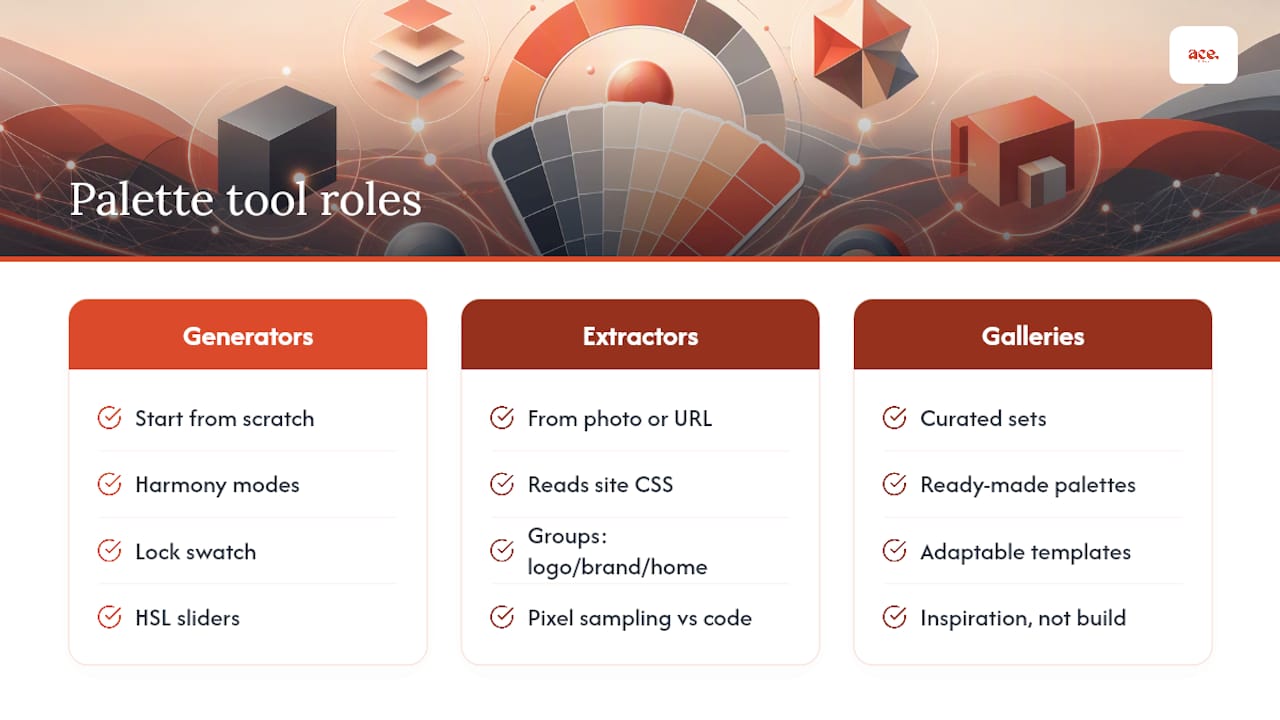
Extractors pull colours from something that already exists, like a photo or a live URL. This matters because pixel sampling an image and parsing a site's actual CSS give different results. A site extractor can read the real colour declarations in the code, grouping them into logo, brand and homepage sets, which is more useful than guessing from a screenshot. Realtime Colors shows your picks on a live mock interface as you adjust them, so you see the palette on buttons and text before committing.
For inspiration rather than generation, Color Hunt and Adobe Express both offer curated, ready-made palettes you can adapt rather than build from zero.
Turn 60/30/10 into named colour roles
The proportion rule only works once you attach it to actual jobs a colour does on the page. Six or seven roles cover almost every site:
- Primary — your main brand colour, used for headers and key buttons (part of the 60%)
- Secondary — supports the primary, fills larger UI blocks (the 30%)
- Accent — for calls to action and highlights only (the 10%)
- Text primary and text secondary — near-black for body copy, a softer grey for captions
- Background light and background dark — for sections and cards, including a dark-mode variant
- Semantic colours — success green, warning amber, error red, used consistently for status messages
A wellness brand might pick a sage green primary, a warm cream secondary, and a coral accent reserved strictly for booking buttons. Keep saturation modest: designers commonly reduce saturation into the 60 to 80% range because fully saturated colours clash with photography and tire the eye on screen. Once your primary is chosen, generate a nine-step tonal scale (50 to 900) running from near-white to near-black, which gives you every shade a UI state needs without inventing new accent colours.
Pro Tip: Build your nine-step scale before you touch the accent colour. Most "too many colours" palettes happen because someone added a new hue instead of reaching for a tint already sitting in the scale.
The contrast checks a palette must pass
A palette that looks good on a moodboard can still fail the people trying to read it. The Web Content Accessibility Guidelines set minimum contrast ratios for a reason: text under those ratios becomes genuinely hard to read for a meaningful share of visitors, not just a theoretical edge case.
Run these before you finalise anything:
- Minimum contrast ratios to aim for include at least moderate contrast for normal body text, a lower minimum for large text and UI elements, and stricter contrast levels recommended for content-heavy or older-audience sites
- A colour-blindness simulation, since red/green combinations can disappear entirely for some visitors
- APCA checks alongside WCAG, as APCA models perceived contrast more accurately on modern screens
For neutrals, avoid pure #000000 and pure #FFFFFF. Near-black and off-white read as more refined and reduce the harsh glare that pure values cause on screens, particularly at night. Never rely on colour alone to convey meaning, either. Pair every status colour with an icon or a text label, so a colour-blind visitor isn't left guessing what a red badge means.
From swatches to code: exporting a palette that developers will use
A palette that lives only in a design file is a palette nobody ships. Export it in whichever format matches the build:
- CSS variables — the safest default for most projects, framework-agnostic and easy to swap later
- Tailwind config — for utility-first stacks, where colours plug straight into class names
- JSON design tokens — for larger teams or multi-platform products that need one source of truth
Most modern palette tools now export directly to CSS custom properties, Tailwind snippets or JSON tokens, which removes the manual retyping that used to cause colour drift between design and build.
| Token | Light value | Dark value |
|---|---|---|
--color-primary | #2E5339 | #8FBE9C |
--color-background | #FAF9F6 | #101312 |
--color-text | #1B1E1C | #EDEFEC |
--color-accent | #E4633D | #F08662 |
Treat dark mode as its own palette rather than a simple invert. Desaturate accents slightly and keep backgrounds tinted near-black instead of pure black, which avoids the harsh flicker that pure inversions cause. Test every swatch at small sizes, too. A colour that reads fine as a large swatch can lose all its nuance in a 16px icon.
Palette trends worth borrowing in 2026
The loudest shift in current design reporting is away from flat, high-contrast digital colour and toward organic, desaturated, earthy tones, particularly across wellness, food and sustainability brands. Years of stark neon-on-white layouts have pushed audiences toward something that feels more grounded and human.
That doesn't mean every site should mute itself. Match the mood to the category:
- Muted, earthy palettes suit wellness, sustainability and professional services, where trust and calm matter more than excitement
- Bolder, saturated accents still work for consumer apps, entertainment and youth brands, where energy is the whole point
- Reserve your brightest colour for the hero section's call to action, keep cards and secondary content on your neutral scale, and let the accent appear rarely enough that it still means something when it does
The handover checklist before anything goes live
Work through this order and you'll catch most problems before a developer ever opens the file:
- Pick the primary colour and confirm it matches brand intent
- Build the neutral scale (near-black to off-white, nine steps)
- Choose one accent, reserved for calls to action
- Run WCAG and APCA contrast checks on every text/background pairing
- Export CSS variables, a Tailwind snippet, and JSON tokens
- Test the palette on real pages, on mobile and desktop
- Document what each role means so nobody guesses later
Hand over the HEX list, the :root CSS block, the Tailwind config snippet, and both light and dark variants together, not scattered across separate files. Naming tokens for humans as well as machines, such as --brand-primary-500 rather than just a HEX code, prevents the usual mix-up where a developer applies the wrong shade from the scale.
Watch for these red flags before release: more than one true accent colour competing for attention, pure black or white neutrals slipping back in, and any button or link that hasn't actually been contrast-tested rather than eyeballed.
Problems with your accent colour crowding the primary almost always show up faster in miniature than at full size.*
What colour actually does to a visitor's brain
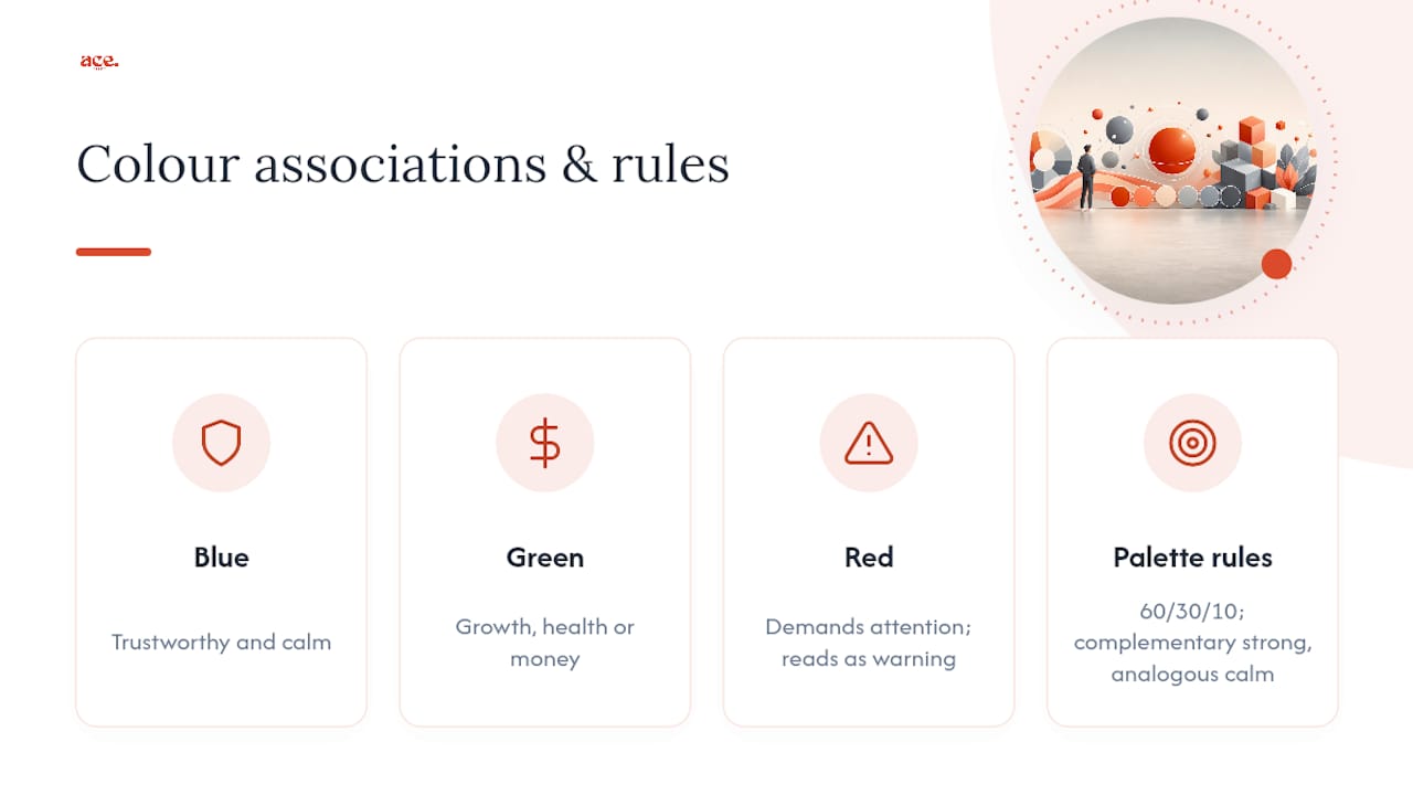
Colour theory for web design boils down to a handful of associations that show up again and again across research and practice. Blue reads as trustworthy and calm, which is why so many financial and healthcare sites lean on it. Green signals growth, health or money, depending on context. Red demands attention, which makes it powerful for urgency and dangerous for anything else, since visitors read red as a warning even when you didn't intend one. Orange and yellow feel energetic and approachable, often used for calls to action precisely because they stand out against calmer surroundings.
None of this works in isolation, though. It's the relationship between colours, not any single hue, that shapes how a page feels. A saturated red accent against a muted sage background reads as confident and intentional. The same red against a bright white background can feel aggressive or cheap, simply because the contrast is harsher and less considered.
Basic colour theory also explains why the 60/30/10 split works so well: it mirrors how the human eye naturally scans a page, resting on the dominant colour first, then moving to secondary blocks, then finally landing on the smallest, brightest area, which is exactly where your call to action should sit. Complementary colours (opposite each other on the wheel) create the strongest contrast and the most energy. Analogous colours (next to each other) create harmony and calm. Neither is better; they're suited to different jobs, and picking one deliberately, rather than by accident, is most of what separates a professional-looking palette from an amateur one.
Colour means different things to different audiences
A palette that feels celebratory in one country can feel funereal in another, and this matters the moment your site reaches beyond a single market. White signifies purity and simplicity across much of the West but is strongly associated with mourning in parts of East Asia. Red is lucky and prosperous in China, yet reads as a warning or danger signal in most Western contexts. Purple carries associations with luxury in many Western markets but has ties to mourning in parts of Latin America and Thailand.
None of this means you need a different palette for every region your site serves. Most small businesses simply need to know their primary audience well enough to avoid an accidental clash. A UK-based service business targeting local customers has far less to worry about here than a global e-commerce brand shipping to a dozen countries with a dozen different colour histories.
The safer approach, if your audience is genuinely mixed, is to lean on colours with fewer strongly negative associations anywhere, such as blues and greens, and reserve culturally loaded colours like bright red or stark white for smaller accent roles rather than dominant brand colours. Test your assumptions if you can, rather than relying on a single region's instincts, and remember that religious and generational associations shift these meanings further still. What reads as bold and modern to one age group can read as garish to another within the very same country.
Testing a palette on real people before you commit
A palette that looks resolved on your screen can still confuse or fatigue actual visitors, and the only reliable way to find out is to put it in front of people who aren't you. Five-second tests work well here: show someone the homepage for five seconds, then ask what they remember and how the page made them feel. If nobody mentions your call-to-action colour, it isn't standing out enough against the rest of the palette.
A/B testing a single variable, such as button colour against an otherwise identical layout, gives you a cleaner read than testing a whole new palette at once, since a full palette change makes it hard to isolate which specific choice moved the needle. Heatmap tools can show whether attention lands where your accent colour intends it to, which is often the fastest way to catch a palette that's technically balanced but practically ignored.
Don't skip the low-tech version, either. Ask three or four people outside the project, ideally people who match your actual customers rather than other designers, to describe the site's mood in one word. If the word doesn't match what the brand is trying to say, the palette needs another pass regardless of how well it scores on any contrast checker.
Gabbi's practical notes from real projects
Most clients arrive wanting five accent colours and leave happier with one, once they see how much calmer a disciplined palette looks in practice. The recurring fix is almost always the same: strip the neutrals back to a proper tonal scale, cut the accent down to a single colour, and only then argue about which shade of it feels right. If you'd rather skip the back-and-forth entirely, aceSites' managed templates already carry a tested balance between brand personality and legibility.
— Gabbi
Get a live site with a working palette, faster
If you've read this far, you've done the hard part: picking roles, checking contrast, exporting tokens. The remaining step, actually building the pages, is where most people lose the afternoon. Some website platforms provide templates with the palette structure already solved: proper primary, secondary and accent roles, contrast-checked text colours, and CSS baked in, so you're customising rather than starting from a blank canvas.
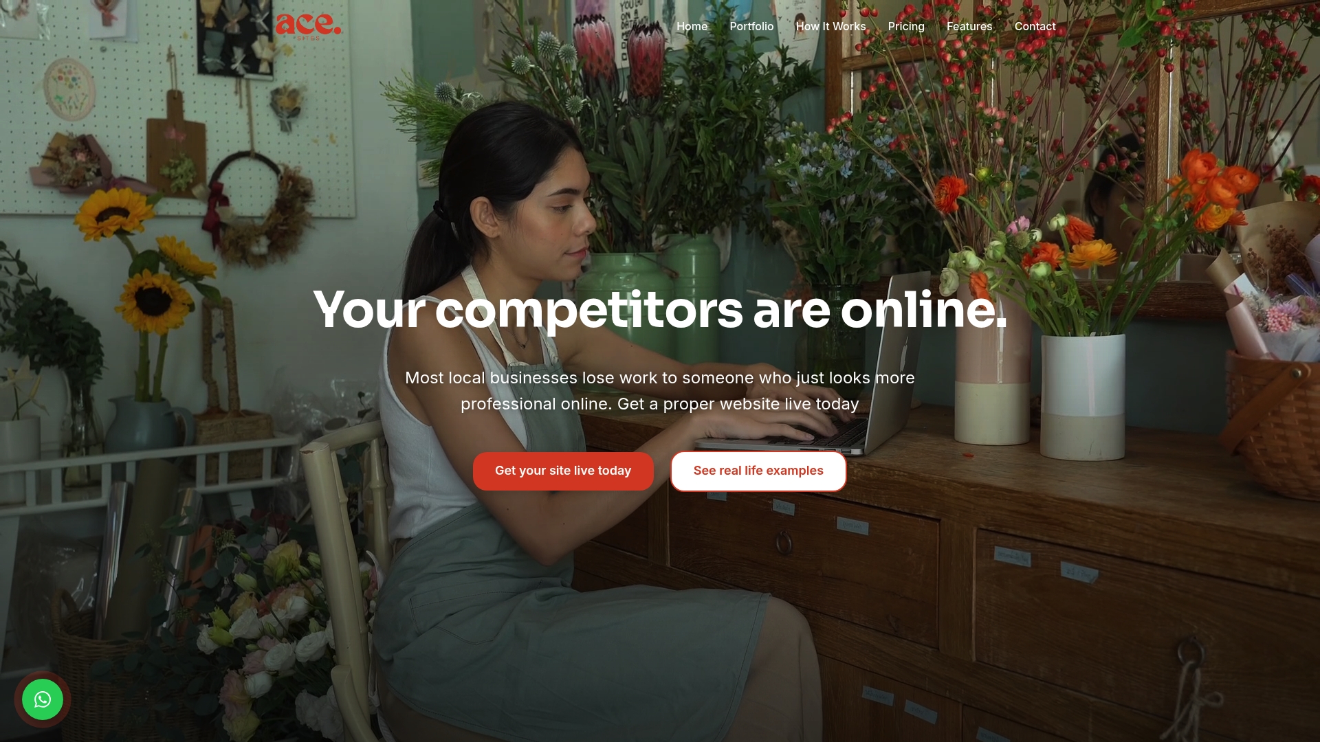
Every template ships with export-ready theming, so the roles and neutral scale you've just worked out slot straight in without a developer translating your tokens by hand. You get a blog manager, SEO tools and booking capabilities alongside the design, which matters if you're a service business trying to get something live rather than perfecting a design file forever. Try the AI website builder and see your own colours applied to a working site in minutes, or compare your palette work against real examples in the aceSites portfolio before you decide.
Essential links for building your palette
Coolors and similar generators export directly to CSS variables and Tailwind config, cutting out manual retyping between design and build. Colorize extracts a live site's actual colour declarations from its CSS, which gives cleaner brand values than sampling a screenshot. The 60/30/10 rule remains the fastest starting framework for balancing any new palette. For accessibility, run every text and background pairing against WCAG contrast guidance before launch, and check how colour and contrast affect scannability if you're pairing a palette with QR codes on printed materials. Finally, 2026 colour trend reporting is worth a look if you want your palette to feel current rather than a leftover from a previous design cycle.
Sources
- The 60/30/10 rule made our website designs infinitely better
- Free Color Palette Generator – CSS Variables & Color Psychology | CSS Genie
- Extract Color Palettes from Any Website - Free Color Palette Generator
- Accessible web design tips — be careful with neutral colours