
Good pricing page design does one job: let someone who already wants your product pick a plan and pay, without friction, confusion, or a spreadsheet. The pattern that works most reliably is a three-tier layout with a clear recommended option, a billing toggle, an estimable pricing unit, and one obvious call-to-action per plan. Everything below unpacks how to build it, with real examples and the tests worth running once it's live.
TL;DR:
- Highlight the most popular plan with visual weight, a badge, and larger padding, but avoid cluttering the recommendation with proximity to prices.
- Use specific savings such as annual discounts or free months, and ensure billing toggle defaults to the most desirable option with visible, real savings.
- Present an estimable unit with a live calculator, and structure tiers where usage naturally clusters, explaining each tier with a clear, one-sentence distinction.
- Limit plans to three for most products, naming tiers by role or fit rather than rank, and include a calculator, example, or clear per-unit rate for estimable pricing.
- Keep microcopy simple and consistent across CTAs, answer objections near CTA with short lines, and ensure FAQs and trust signals are strategically placed for maximum reassurance.
Table of Contents
- What can we learn from real pricing page examples?
- What does a pricing page actually need above the fold?
- How many pricing tiers should you show?
- How do you design CTAs, toggles and comparison tables?
- What should you A/B test on a pricing page?
- Where should FAQs and trust signals sit?
- Why simplicity beats cleverness on small business pricing pages
- Sources
What can we learn from real pricing page examples?
You don't need to reinvent pricing table design. The best pages borrow a handful of patterns, and each one teaches a single lesson worth stealing on its own.
- Three-tier layout with a recommended badge. The middle plan gets a highlighted border, a "Most Popular" tag, and slightly larger padding. Copy this: visual weight should draw the eye without shouting. Don't copy: badges that sit so close to the price they look like a discount sticker rather than a recommendation.
- Billing toggle with a concrete saving. Rather than "Save 20%", strong examples state "Save £48 a year" or "2 months free". Copy the specificity. Skip toggles that animate so slowly they feel unresponsive on a phone screen.
- Estimable unit with a live calculator. Usage-based products (email tools, storage, API calls) often show a slider that updates the price as you drag it. Copy the instant feedback loop. Avoid calculators with no default value; an empty field makes people abandon before they start.
- Enterprise as a strip, not a column. Rather than cramming a fourth priceless card into the grid, stronger pages run enterprise as a full-width band beneath the tiers with a "Talk to us" button. Copy the separation. Don't squeeze it into the same visual rhythm as the paid tiers, it confuses the eye.
- Comparison table below the cards. Once someone has narrowed to two options, a feature table confirms the decision. Copy the placement, below, not above, the tiers. Skip tables with forty identical rows; nobody reads past row ten.
- Single-plan pages for narrow tools. A calculator app or a one-feature widget sometimes just needs one price and one button. Copy the restraint. This only works when the product genuinely does one thing.
- Mobile stacking. Cards that sit side by side on desktop stack vertically on phones, with the recommended plan pushed to the top of the stack rather than buried in the middle. This matters because mobile-first layouts and accessible toggles are now treated as a baseline requirement, not a nice extra.
Each pattern solves a different problem. Mix and match rather than copying a whole page wholesale.
What does a pricing page actually need above the fold?
Run a five-second test on your own page: can a stranger see who it's for, the price and its unit, which plan is recommended, a working call-to-action, and a quick route to enterprise or contact? If any of those five things is missing, the page isn't finished.
Most teams overcorrect the wrong way. They add a paragraph of persuasive copy above the pricing cards, something about "trusted by thousands" or a mission statement, and push the actual prices further down the page. That's backwards. A visitor on a pricing page has already decided to look at numbers; they're doing arithmetic, not reading a sales pitch. The strongest pricing pages put reassurance and testimonials below the tiers, not above them.
Four structural decisions determine whether the rest of the page works:
- Pick a unit people can estimate. Per seat, per project, per email sent, whatever it is, the visitor should be able to guess their own number within a few seconds.
- Set tier boundaries where usage actually clusters. If most customers use between 5 and 20 seats, don't split your tiers at 3 and 50; you'll push the majority into the wrong column.
- Give each tier one sentence of distinction. "For solo freelancers", "For growing teams", "For agencies managing multiple clients." One line, no paragraph.
- Answer the objection that's blocking the click. If people worry about lock-in, say "Cancel any time." If they worry about hidden costs, say "No setup fees."
Pro Tip: On mobile, put the recommended plan first in the stack, not the cheapest one. Thumbs scroll down, and most people never reach the third card before deciding.
How many pricing tiers should you show?
The number of plans you show should match how different your customers actually are, not how many features you've built.
- One plan works for narrow, single-purpose tools where everyone pays the same and gets the same thing.
- Two plans make sense when there's one obvious split, free versus paid, individual versus team.
- Three plans are the sensible default for most self-serve products. A three-tier structure converts roughly 20 to 30% better than pricing pages with five or more columns, largely because more options create more hesitation, not more sales.
- Four or more plans only earn their place when you have genuinely distinct buyer personas, not just different feature bundles for the same buyer.
Name tiers by role or fit rather than by tier rank. "Starter", "Growth", "Scale" tells a visitor nothing about themselves. "Solo", "Small Team", "Agency" does the work instantly, especially when paired with a one-line differentiator underneath each name.
For estimable pricing, three tactics do most of the heavy lifting: a calculator with a sensible default already filled in, a worked example ("a typical five-person team pays around £75 a month"), and, for usage-based products, a clear per-seat or per-unit rate stated next to the total rather than buried in small print.
How do you design CTAs, toggles and comparison tables?
Small components carry a surprising amount of the persuasion. Get the microcopy wrong and even a well-structured page underperforms.
- One verb per plan family. "Start Free Trial" for the paid tiers, "Talk to Sales" for enterprise. Mixing verbs across columns makes visitors pause to work out what's different.
- State the catch under the button. "No credit card required" or "14-day free trial, cancel any time" removes the hesitation before it forms.
- Keep CTA buttons visually equal in weight across the standard tiers; reserve the strongest colour contrast for the recommended plan only.
- Default the billing toggle to whichever term you want most customers to choose, and show the saving as a real number. Toggles that state a concrete saving convert noticeably better than ones that just say "Save more."
- Put enterprise in a full-width strip, not a fourth column with a blank price. A missing number reads as "expensive and hidden," which repels the exact buyers it should reassure.
- Trim the comparison table to differentiating rows only. Rows that are identical across every plan add nothing and just push the decisive rows further down the page. Order the table so the rows that actually swing a decision sit near the top, and let it collapse into an accordion on mobile rather than forcing a sideways scroll.
Pro Tip: Three short lines placed near every CTA, "No credit card required", "Cancel any time", "Upgrade or downgrade whenever you like", quietly remove most of the objections that stop someone clicking.
What should you A/B test on a pricing page?
Pricing pages reward small, deliberate tests far more than they reward wholesale redesigns. Prioritise in this order:
- Test the anchor position. Does moving the highest-priced plan to the left or right change which tier people choose?
- Test the recommended badge. Run one version with a "Most Popular" tag and one without; the badge alone often shifts selection more than a price change would.
- Test the billing toggle default. Monthly-first versus annual-first changes signups without touching a single price.
- Test CTA wording. "Start Free Trial" against "Get Started" against "See Plans" can move click-through by itself.
- Test the order of comparison table rows. Leading with the row your target buyer cares about most can lift table engagement and downstream conversion.
Track plan-level click-through, trial signups, trial-to-paid conversion, average revenue per user, and churn in the weeks after any pricing change. Run each test for two to four weeks minimum, never change two variables at once, and keep an eye on bounce rate and support ticket volume as early warning signs something's confusing people.
Where should FAQs and trust signals sit?
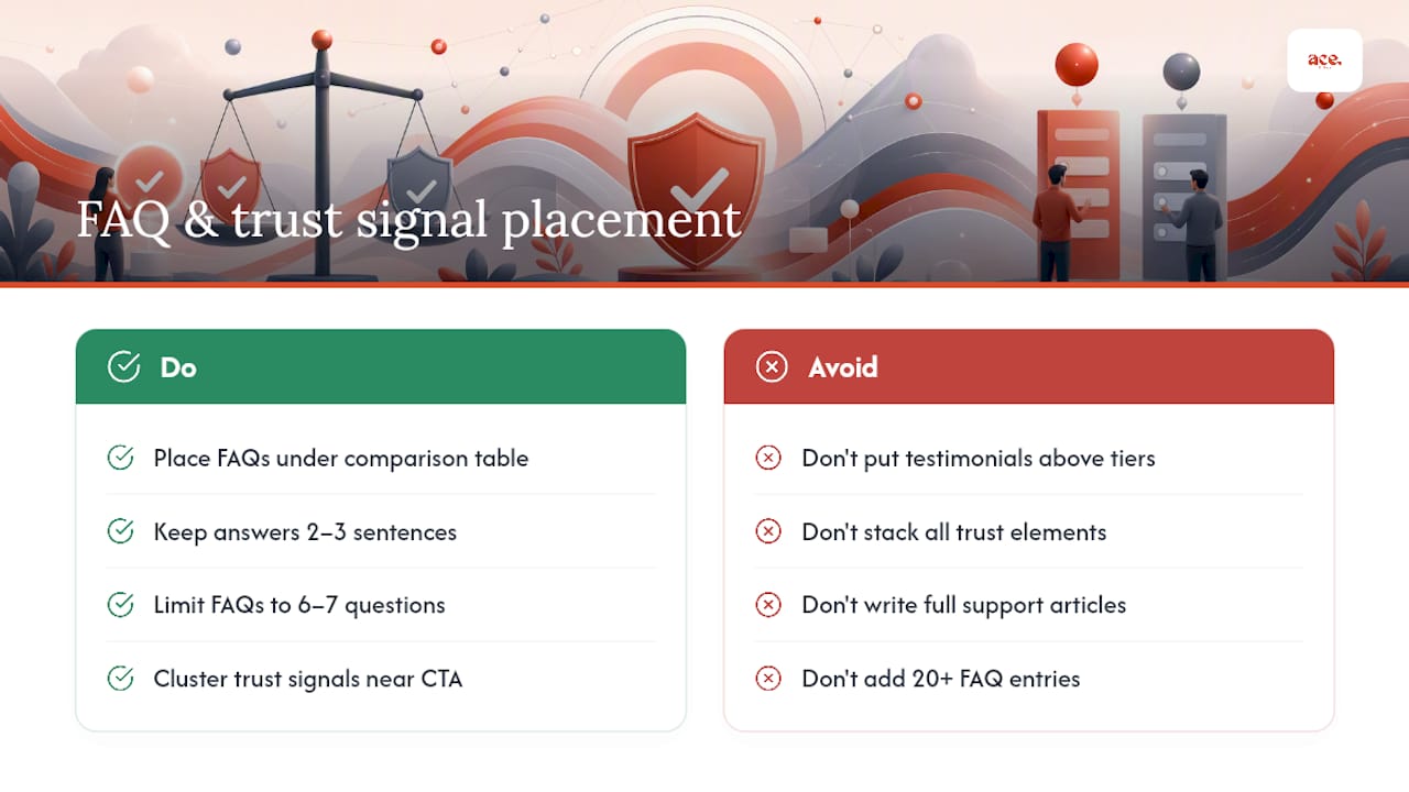
FAQs belong directly beneath the comparison table, answering the handful of questions that stop a purchase: what happens at the end of a trial, whether you can change plans later, how refunds work, and what counts towards the usage limit. Keep answers to two or three sentences; a pricing page FAQ is not the place for a full support article.
Trust signals work best placed close to the CTA rather than scattered across the page. A small cluster of customer logos, a review score, or a security badge sitting just under the buttons reassures someone at the exact moment they're deciding, rather than earlier in a hero section they've already scrolled past. Testimonials, if you use them, read better below the tiers than above; a visitor comparing numbers doesn't want a quote block interrupting the arithmetic.
Avoid stacking every trust element in one place. A logo strip up top, a review score near the CTA, and a security or guarantee note in the footer spreads reassurance across the page without cluttering any single section. And keep the FAQ genuinely short, six or seven questions maximum. A pricing page with twenty FAQ entries signals that the pricing itself isn't clear enough to stand on its own.
Why simplicity beats cleverness on small business pricing pages
I've looked at enough pricing pages to notice a pattern: the ones that convert well are almost always the least clever. Small business owners don't need decoy pricing tricks or five-tier ladders designed to nudge people toward the middle option. They need a page where a plumber, a beautician, or a personal trainer can glance at it and know exactly what they're paying and what they get.
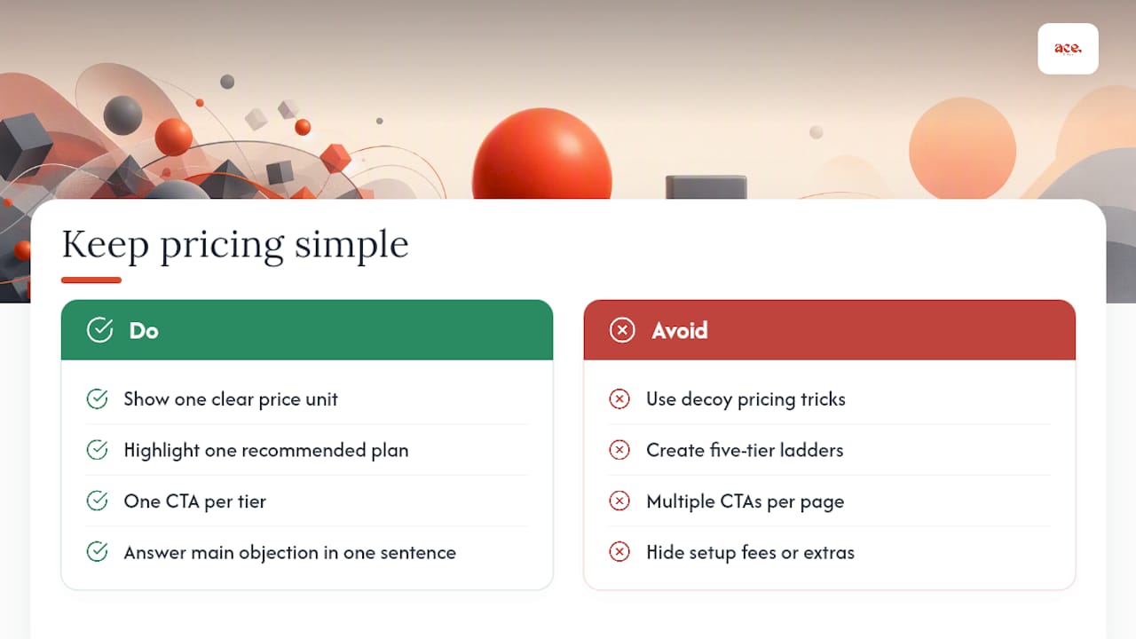
That's the philosophy behind how Ace-sites structures pricing for its own customers, published rates, no hidden setup fees, and a straightforward path to a done-for-you build for anyone who'd rather skip the DIY route entirely. The portfolio of real business websites built on the platform shows the same restraint carried through to client sites: clear tiers, one obvious action, nothing to decode.
Give your own page ten minutes and check it against this: one clear unit, one recommended plan, one CTA per tier, and one sentence answering the objection most likely to stop a sale.
— Gabbi
Sources
- The SaaS pricing trap — when too many tiers kill conversions
- What the best pricing pages do
- SaaS pricing page best practices: anatomy, layout & fixes (Kompassify)