
For most small business websites, the winning layout is a content-first hero with one clear conversion path, followed by supporting sections that answer visitor questions in order of priority. That's it. You don't need a clever grid or a fancy animation to make a homepage work — you need clarity about who you are, what you do, and what happens when someone clicks.
Once that's sorted, the layout you choose depends on your goal:
- Lead generation (plumbers, therapists, consultants): fullscreen hero with a phone number and enquiry form above the fold
- Ecommerce: grid layout showcasing products, with a search bar and category navigation visible early
- Portfolio or creative work: magazine-style or asymmetrical layout that lets images do the talking
- Blog or content site: single-column layout with a featured post and clear category links
- SaaS or software: split-screen layout pairing a benefit statement with a product screenshot
Pick your goal first, then choose the layout. Test it with real visitors before you fall in love with it.
Key Takeaways
A homepage works when it answers who you are, what you do, and what to do next within seconds, using one clear conversion path rather than several competing ones.
| Point | Details |
|---|---|
| Answer the three questions first | Confirm who you are, what you do, and the next step before choosing any visual layout. |
| Pick one primary CTA | Remove competing buttons from the hero to reduce decision friction and lift completion rates. |
| Design the fold as a promise | Treat the visible area as a reason to scroll rather than a fixed pixel target, per NN/g guidance. |
| Build the footer with intent | Include contact details, a sitemap, a repeated CTA, and trust signals rather than a bare copyright line. |
| Use Ace-sites to implement fast | Ace-sites templates ship with mobile-optimised, SEO-ready layouts, so you can go from idea to live homepage in under a day. |
Table of Contents
- Homepage layout ideas start with three non-negotiable questions
- Ten homepage layout ideas worth trying
- How to choose the right layout for your goals
- Getting the above-the-fold area right
- Footer design that actually earns its space
- Where to find homepage design inspiration
- Implementing your chosen layout without the guesswork
- Common homepage layout mistakes and how to fix them
- What the data actually tells you to prioritise
- Get your chosen layout live without hiring a designer
- Sources
Homepage layout ideas start with three non-negotiable questions
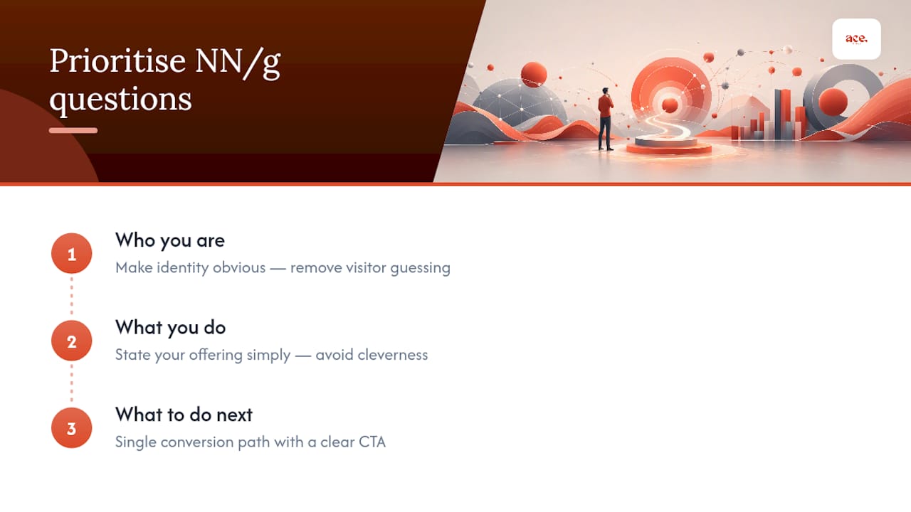
Before you touch a grid or a colour palette, you need to answer three questions on every homepage you build. The Nielsen Norman Group's homepage design principles put it plainly: visitors need to know who you are, what you do, and what they should do next, all within seconds of landing. Miss any one of these and people bounce, no matter how attractive the layout looks.
Here's how that plays out in practice:
- Who you are — your logo and a short line of positioning, not a paragraph of history.
- What you do — a headline that states your service or product in plain language, avoiding vague slogans.
- What to do next — one clear action, whether that's "book a call," "get a quote," or "shop now."
The third point trips up more homepages than the other two combined. Many small business sites offer five different calls to action in the hero alone: "Learn more," "Contact us," "View services," "Sign up," and "Call now" all fighting for the same click. A single, obvious primary path reduces the mental effort a visitor has to spend, and that translates directly into more people completing the action you actually want.
Pro Tip: If you can't decide which button to keep, ask what a large majority of your visitors want to do. Build the hero around that single action and move the rest into the navigation or footer.
Accessibility belongs in this checklist too, not as an afterthought. The W3C's WCAG 2.1 guidance requires that any moving or auto-updating content, such as a hero carousel, can be paused or stopped by the visitor. That's not a nice-to-have for a niche audience: the WebAIM Million report found accessibility failings are common across homepages generally, which means basic checks like colour contrast and keyboard navigation deserve a spot in every design review, not just for sites with a specific compliance requirement.
Statistic callout: Attention doesn't split evenly across a page. Older usability research consistently found the majority of visitor attention concentrates near the top of the page, which is exactly why the Semrush guidance on above-the-fold design recommends putting your strongest message and clearest next step where people look first, then using visual cues to pull them further down.
Ten homepage layout ideas worth trying
Once the fundamentals are locked in, the layout itself becomes a tool for organising content, not a decoration. Each pattern below solves a different problem. Pick the one that matches your content and goal, not the one that looks trendiest on Pinterest.
-
Grid layout. Content sits in evenly sized boxes or cards across the page, ideal for product catalogues, service menus, or blog archives. Best use: ecommerce homepages or any site with several similar offerings to compare. Implementation tip: keep card sizes consistent and make sure the grid collapses to a single column on mobile, rather than shrinking into unreadable tiles.
-
Z-pattern layout. Visitors scan in a Z shape: top left, top right, bottom left, bottom right. Best use: simple, single-message homepages with one hero image and one CTA, common for local service businesses. Implementation tip: place your logo top left, your CTA top right, then repeat the CTA at the bottom right where the eye naturally lands last.
-
F-pattern layout. Suited to text-heavy pages where visitors scan horizontally along the top, then drop down and scan a shorter line, forming an F shape. Best use: content sites, news homepages, or service pages with several paragraphs of explanation. Implementation tip: front-load the most important words at the start of each line and heading, since that's where eyes linger longest.
-
Split-screen layout. The page divides into two vertical halves, often pairing an image with text or two competing offers. Best use: SaaS products showing a screenshot next to benefit copy, or businesses with two distinct customer types. Implementation tip: on mobile, stack the halves vertically with the message above the image, not below it, so the value proposition still loads first.
-
Fullscreen hero layout. A single large image or video fills the entire viewport, with a headline and CTA layered on top. Best use: businesses that sell on visual appeal, such as photographers, venues, or hospitality. Implementation tip: compress hero video and images aggressively; a beautiful hero that takes six seconds to load will lose visitors before they see it.
-
Single-column layout. Everything stacks in one vertical line with no side-by-side elements. Best use: blogs, personal portfolios, or simple lead-generation pages where you want a linear story with no distractions. Implementation tip: this is naturally mobile-friendly already, but on desktop, keep line lengths to around 60 to 75 characters so text doesn't stretch edge to edge.
-
Card or box layout. Similar to grid but with more visual weight per item, often including images, short text, and a mini CTA inside each card. Best use: homepages showcasing multiple services, team members, or case studies. Implementation tip: limit each card to one action; a card with three links inside it defeats the purpose of the format.
-
Asymmetrical layout. Deliberately unbalanced compositions, with large and small elements mixed to create visual tension and draw the eye. Best use: creative agencies, designers, or brands wanting to signal originality. Implementation tip: asymmetry needs a strong underlying grid to avoid looking broken. Use design principles like proximity and similarity, drawn from Gestalt theory, to keep related elements visually grouped even when their sizes differ.
-
Magazine or portfolio layout. Borrows from print editorial design, mixing large feature images with smaller supporting content blocks, headlines, and pull quotes. Best use: photographers, writers, artists, or any business where the work itself is the pitch. Implementation tip: limit yourself to one featured piece above the fold rather than a wall of thumbnails, which overwhelms new visitors.
-
Minimalist layout. Generous white space, one message, one image, one CTA, nothing else competing for attention. Best use: premium or luxury positioning, or any business whose story is simple enough not to need explanation. Implementation tip: minimalist doesn't mean empty. Every element that remains has to work harder, so test your single headline extensively before you commit to it.
A few practical notes apply across all ten:
- Every layout needs a mobile-first check; more visitors will land on a phone than a desktop screen for most small business sites.
- None of these patterns are mutually exclusive. A homepage often opens with a fullscreen hero, moves into a grid of services, then closes with a single-column story section.
- Boxed layouts, where content sits inside a contained width rather than stretching edge to edge, work well combined with any of the above when you want a more structured, less overwhelming feel.
How to choose the right layout for your goals
Matching a layout to your site isn't guesswork if you answer a handful of questions honestly before you start designing.
Run through this checklist first:
- What's the single most important action you want a visitor to take? Book, buy, call, subscribe. Pick one.
- What content do you actually have? A service business with no product photography shouldn't force a fullscreen hero built around imagery it doesn't own.
- What device will most visitors use? Check your analytics; if 70% arrive on mobile, design the phone view first and treat desktop as the adaptation.
- What tone does your brand need? A minimalist layout suits a premium consultancy; a card-based grid suits a busy local trades business with several services to list.
- What are your technical limits? A hand-coded asymmetrical layout takes longer to build and maintain than a template-based grid.
Once you've got answers, test rather than guess. Simple A/B tests, such as swapping a single CTA's wording or moving the enquiry form higher on the page, often reveal more than a full redesign. Even without formal split-testing tools, watching where visitors drop off in your analytics tells you plenty.
Pro Tip: If you're torn between two layouts, build the simpler one first. You can always add visual complexity later, but stripping a cluttered homepage back down is a much bigger job.
Templates make sense when your content fits a common pattern: local services, portfolios, and blogs almost always do. Bespoke design earns its cost when your offering genuinely doesn't fit an existing mould, such as a business selling a highly unusual product or a multi-sided marketplace with several distinct visitor types to serve on one page.
Getting the above-the-fold area right
Forget the idea that "the fold" is a fixed line at 600 pixels or wherever your monitor happens to cut off. The NN/g manifesto on page fold design argues convincingly that the fold varies by device, screen size, and browser, so designing to an exact pixel height is a wasted exercise. What matters instead is treating the visible area as a promise: give visitors enough reason to believe scrolling further will be worth their time.
That promise needs a few specific ingredients:
- A clear, benefit-led headline (your H1) that states what you do in plain terms
- One supporting line that adds the detail the headline can't fit
- A single call-to-action button, not three competing ones
- A supportive image or short video that reinforces the message rather than distracting from it
- A subtle scroll cue, such as a downward arrow or partially visible content below
The Shopify guide to above-the-fold design recommends testing variations of this hero composition rather than assuming your first attempt is correct. And whatever visual media you use, keep it light: a heavy hero video that stalls the page violates both the performance and the accessibility guidance covered earlier, since slow-loading pages frustrate everyone and animated media without pause controls creates genuine barriers for some visitors.
Footer design that actually earns its space
The footer is where visitors go when they've scrolled the whole page and still have a question, so treat it as a second chance rather than a dumping ground for links nobody asked for. Awwwards' footer showcase makes the case that well-designed footers function as a deliberate navigation and conversion tool, not an afterthought bolted on at the end of a project.
A solid footer typically includes:
- Contact details (phone, email, address) for visitors who scrolled looking for exactly this
- A simple sitemap or key page links, so lost visitors can reorient
- A repeated version of your primary call-to-action
- Trust signals: reviews, certifications, or accreditations
- Legal essentials: privacy policy, terms, and cookie information
- Social media links, kept small and secondary
Three footer patterns cover most small business needs. A contact-focused footer suits service businesses where the phone number matters most. A CTA-focused footer repeats the main button for sites built around one conversion goal. A link-rich footer suits larger sites with many pages that need findability. Whichever you choose, keep text legible (dark backgrounds need genuinely light text, not mid-grey) and keep microcopy short enough to scan in a few seconds.
Where to find homepage design inspiration
You don't need to design a layout from a blank page. Real examples show you what actually works for businesses like yours, and adapting a proven template beats reinventing one.
Look at examples by site type rather than browsing generically:
- Local service businesses benefit from Z-pattern or fullscreen hero layouts built around trust and a phone number
- Portfolios and creative work suit magazine or asymmetrical layouts that let images lead
- Ecommerce sites need grid layouts with clear category navigation
- SaaS products often work best with split-screen layouts pairing a screenshot with benefit copy
When adapting any template, change the headline and imagery first, since generic stock photography and placeholder copy are the fastest way to undermine an otherwise solid layout. The aceSites portfolio shows real small business homepages built from templates, adjusted to match each business's own branding without breaking the underlying structure.
Implementing your chosen layout without the guesswork
Choosing a layout is one problem. Building it without hiring a developer is another. That's where a platform built specifically for small business owners earns its keep: templates that already follow the principles covered above, so you're not reinventing the hero composition or footer structure from scratch.
Every aceSites template ships mobile-optimised, with built-in SEO tools and a blog manager, so the single-column and grid layouts covered earlier come ready-configured rather than requiring custom code. The platform's booking widget embeds and contact forms slot directly into the "one clear conversion path" principle NN/g recommends, and the announcement bar and pop-up builder give you a controlled way to add a secondary message without cluttering the hero itself.
Practical next steps depend on how hands-on you want to be:
- Try the AI website builder if you want to generate a working homepage in minutes and refine it yourself
- Request the done-for-you build service if you'd rather brief someone and get a finished layout back
- Browse live examples to see which layout pattern matches your industry before you start
Common homepage layout mistakes and how to fix them
Most homepage problems trace back to a handful of repeat offenders, and each one has a straightforward fix.
Too many competing CTAs. A hero with five buttons leaves visitors doing the deciding you should have done for them. Fix it by choosing one primary action and demoting the rest to the navigation.
Burying the value proposition below decorative content. A stunning hero image with no headline explaining what you do wastes the most valuable space on the page. Fix it by writing the headline first and designing around it, not the other way round.
Ignoring mobile until the end. A layout that looks superb on a widescreen monitor often collapses into an unreadable mess on a phone. Fix it by designing mobile first and treating desktop as the expanded version.
Slow-loading hero media. A beautiful fullscreen video that takes eight seconds to load loses visitors before they see it. Fix it by compressing media aggressively and testing load speed on a real mobile connection, not just office WiFi.
Neglected footers. A footer with nothing but a copyright line wastes a visitor who scrolled the whole page looking for reassurance. Fix it by treating the footer as a second homepage, with contact details, trust signals, and a repeated CTA.
Auto-playing carousels with no pause control. Beyond the accessibility problem this creates under WCAG guidance, carousels also bury your best message behind slides most visitors never see. Fix it by using a single strong hero image instead, or adding visible pause controls if you keep the carousel.
What the data actually tells you to prioritise
Most homepage advice online focuses on trends: parallax scrolling, oversized typography, split-screen video heroes. None of that is wrong exactly, but it's the wrong starting point. The research consistently points somewhere less exciting: clarity beats cleverness, and a single conversion path beats a menu of options every time.
Where conventional advice falls short is treating layout as a design choice made in isolation from content. A gorgeous asymmetrical layout built around photography you don't have is worse than a plain single-column page built around copy you've actually written well. The layout should follow from what you have to say and who needs to hear it, not the other way round.
If you take one thing from this, prioritise the three NN/g questions over every visual decision. Get "who you are, what you do, what to do next" right, and even a fairly ordinary layout will outperform a stunning one that leaves visitors guessing. Fix that first. Worry about grids and asymmetry second.
Get your chosen layout live without hiring a designer
Reading about layouts is one thing. Actually building one, without wrestling with code or waiting weeks for a developer, is another problem entirely. Ace-sites solves that gap directly: it's a platform built for small business owners who need a professional homepage live fast, without agency fees or a lengthy back-and-forth brief.
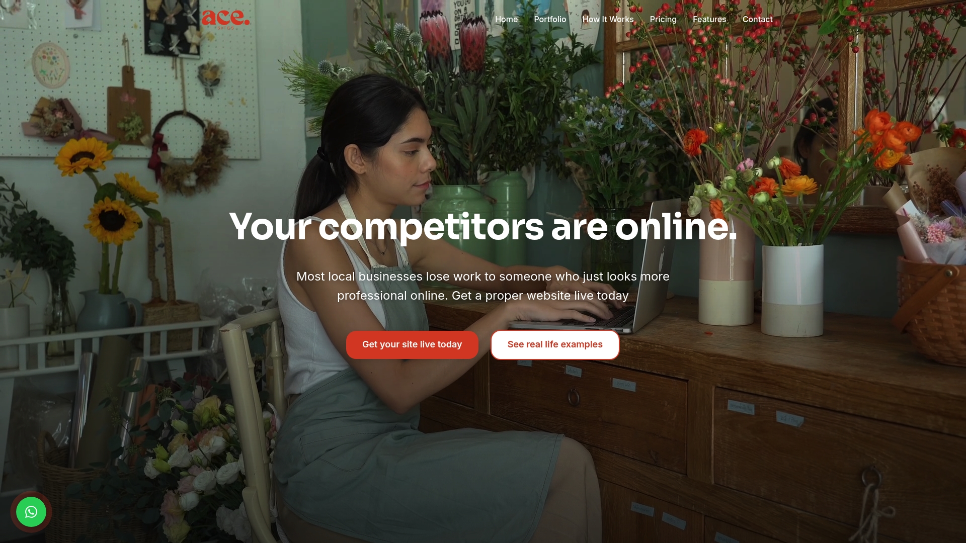
Every template on Ace-sites already reflects the principles covered above: a single clear conversion path, mobile-optimised structure, and built-in SEO tools so your new homepage isn't just good-looking but actually findable. Whether you fancy the grid layout for a growing service list or a simple single-column page to tell your story, the platform's templates come pre-configured rather than needing custom build work.
If you'd rather build it yourself, the AI website builder gets a working homepage online in minutes. If you'd prefer to hand the whole job over, the done-for-you service lets you brief your business once and receive a finished site back, with no hidden costs and no technical skill required on your end. Either route gets you live in under a day.
Sources
- Homepage design: 5 fundamental principles — NN/g
- 15 excellent creative website footers — Awwwards
- WebAIM Million report — WebAIM