
Yes, email popups still work. Start by testing a welcome discount, a two-step educational flow and a simple gamified wheel, since these three formats consistently outperform basic single-field boxes. Top campaigns reach higher conversion rates, though most sit far lower, so the type you choose and how you build it matters more than whether you use one at all.
TL;DR:
- Discount popups offering 10 to 20% off or free shipping consistently generate higher conversion rates than other formats.
- Gamified popups like spin-to-win or scratch cards can outperform standard discounts among engaged users but require careful UX design.
- Educational and multi-step popups reduce friction by pairing simple questions or guides with email capture, especially for content-driven sites.
- Popup triggers based on scroll depth, time spent, or exit intent should be prioritized, with welcome triggers for high-intent traffic producing the best results.
- Most small businesses can deploy GDPR-compliant popups within a day using templates, focusing on appropriate timing and relevance rather than elaborate design.
Table of Contents
- Email popup examples that actually convert, grouped by type
- What makes an email popup convert?
- How do you implement and test a popup properly?
- Email popup benchmarks: what conversion rates actually look like
- How aceSites approaches popups for small business sites
- When should you actually use a popup, and when should you skip one?
- Get a GDPR-ready site with popups live in a day
- Sources
Email popup examples that actually convert, grouped by type
Every strong popup falls into one of a handful of mechanisms. Once you know which lever you're pulling, whether that's a discount, a game, or a piece of gated knowledge, you can borrow the pattern rather than starting from a blank canvas. Below are practical, anonymised examples grouped by type, each with the design or copy detail that made it work.
Discount popups
Discount popups remain the workhorse of email capture. They're blunt, they're easy to understand, and shoppers respond to them because the value is obvious in under two seconds.
- The classic 10% welcome offer. A single headline ("Get 10% off your first order"), one email field, and a bold CTA button. No imagery, no distractions. This pattern converts well precisely because it asks for almost nothing in return for a clear reward.
- The 15% tiered offer with urgency. Same structure, but adds "today only" or a 20-minute countdown timer beneath the CTA. Urgency lifts conversion when it's genuine, but a fake countdown that resets on refresh erodes trust fast.
- The free shipping swap. For stores where margins can't absorb a discount, "Free shipping on your first order" performs almost as well as a percentage-off deal, particularly for anyone already sitting in the cart.
- The 20% "for new customers only" popup. Paired with a small line of reassurance ("no spam, unsubscribe anytime"), this variant tends to do well on higher-ticket product pages where shoppers are more cautious about handing over their email.
Discount codes between 10% and 20% off, alongside free shipping and downloadable guides, remain the most reliable incentives for lifting signup rates, largely because they're instantly understandable without requiring the visitor to think.
Gamified and spin-to-win popups
Gamified popups turn signup into a small moment of fun, which is exactly why they can outperform flat discount boxes among the right audience when using tools like Hopper.
- The spin-to-win wheel. Segments range from "5% off" to "Free gift", with one deliberately weighted grand prize. The visitor spins once, sees a result, and enters their email to claim it.
- The scratch card reveal. A visual scratch animation replaces the wheel, landing on a discount tier. It works particularly well on mobile, where a spinning wheel can feel fiddly to tap.
- The mystery box popup. Three or four boxes are shown, each hiding an undisclosed reward. Curiosity does the heavy lifting here rather than a stated discount.
Gamified flows can generate a meaningful lift in engaged audiences, but they carry more UX complexity than a simple discount box, and rushed implementation can create more friction than it removes. Test the mechanism on a small percentage of traffic before rolling it out site-wide, and always pair the reward with onboarding emails that keep new subscribers engaged past the initial spin.
Educational and multi-step popups
These popups sell information rather than a discount, which makes them a natural fit for service businesses, coaches, and anyone whose product isn't primarily physical retail.
- The quiz-style popup. "What's your skin type?" or "Which package suits your business?" asks one or two low-effort questions before requesting an email to reveal the answer. The micro-commitment of answering a question first makes the email request feel like a natural next step rather than a cold ask.
- The gated guide popup. "Download our free pricing guide" trades a genuinely useful PDF or checklist for an email address. This performs best on content-heavy sites like blogs or advice pages, where the audience already trusts the source.
- The two-step "yes/no" popup. Rather than showing a form immediately, the first screen asks a simple preference question with two buttons. Saying "yes" reveals the email field. Micro-commitment popups like this reduce perceived friction and improve eventual capture rates compared with a form that demands information straight away.
Pro Tip: If you're testing an educational popup, keep the "reveal" screen to one field. Multi-step doesn't mean multi-field. The steps should reduce friction, not add form fatigue at the finish line.
Slide-in and top bar popups
Slide-ins and top bars are the quiet workers of the popup world. They don't interrupt the page the way a full-screen overlay does, which makes them a sensible default for readers who find aggressive popups off-putting.
- The bottom-corner slide-in. Appears after a set scroll depth, sits in the corner rather than centre-screen, and can be dismissed with a single click. Ideal for blogs and service pages where you don't want to block the content someone came to read.
- The top bar announcement. A slim strip across the top of the page combining a short offer with an email field, often used for newsletter subscriptions on content sites rather than product discounts.
Exit-intent popups
Exit-intent popups fire when a visitor's cursor movement suggests they're about to leave the page or close the tab. They can rescue a small percentage of otherwise lost visitors, but they shouldn't be your main strategy.
- The "before you go" discount. A last-chance 10% offer, framed as a genuine save rather than a guilt trip.
- The cart-abandonment reminder. Shows the items left in the basket alongside an email field, useful for ecommerce sites specifically.
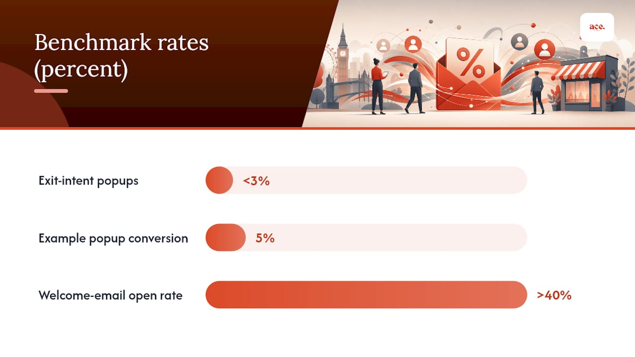
Exit-intent popups typically convert below 3%, well behind welcome and engagement triggers, which is why treating them as a defensive backstop rather than your primary capture tool makes more sense. Save the strongest offer for the trigger most likely to actually convert, and let exit-intent catch whatever's left. If you want to see how popups plug into a wider enquiry funnel, our guide on getting more enquiries from your website covers where they sit alongside contact forms and booking widgets.
What makes an email popup convert?
A popup converts when five things line up at once: a clear value proposition, the right trigger, low friction, solid design, and some degree of targeting. Miss one, and the others have to work harder to compensate.
Value proposition first. Visitors decide whether to engage in under a second, so the headline needs to say exactly what they get. "Join our newsletter" says nothing. "Get 15% off plus first access to new stock" says everything. Urgency helps, but only when it's true. Relevance beats urgency almost every time, because a fake deadline that visitors have seen before trains them to ignore your popups altogether.
Trigger logic matters more than most marketers assume.
- Welcome triggers (fired on arrival or after a short delay) suit high-intent traffic arriving from ads or search.
- Scroll-depth triggers, commonly set around 60% of the page, catch visitors who've shown genuine interest in the content.
- Time-on-page triggers, often 30 seconds or more, work well on blogs where reading time signals engagement.
- Exit-intent triggers should sit last in the priority order, reserved for visitors who've shown no other signal of interest.
These scroll and time thresholds are common heuristics used across popup design precisely because they correlate with a visitor actually reading, rather than bouncing straight off the landing page.
Form friction quietly kills more signups than bad design does. A single email field with one button consistently outperforms name-plus-email-plus-phone forms, because every additional field is a chance for someone to abandon the popup. Two-step popups (a quick preference question, then the email field) can lift completion further by breaking the ask into smaller, easier commitments.
Design principles worth following:
- Use strong contrast between the CTA button and the background, not just a different shade of your brand colour.
- Keep copy to one headline, one supporting line, and a CTA. Cut anything else.
- Write CTA buttons as an action ("Get My Discount") rather than a flat label ("Submit").
- Design mobile-first. On smaller screens, oversized close buttons and a single-column layout matter more than they do on desktop.
Statistic to remember: popups that ignore relevance in favour of blanket targeting tend to damage long-term engagement rather than build it, which is why interruptive design that ignores user context is consistently flagged as counterproductive in usability research. Basic segmentation, showing a different popup to new visitors versus returning ones, or blog readers versus product-page browsers, closes most of that gap without needing a personalisation engine.
How do you implement and test a popup properly?
Getting a popup live is the easy part. Getting a popup that's worth keeping live takes a short, deliberate process.
- Pick one objective. Growing your list, rescuing abandoned carts, and gating a piece of content are three different jobs, and each maps to a different popup type. Don't ask one popup to do all three.
- Define your audience and trigger. Decide whether the popup targets new visitors, returning visitors, or a specific page type such as blog posts versus product pages. This decision shapes everything that follows.
- Build the test plan before you build the popup. Decide what you're testing first, headline, offer size, or trigger timing, rather than changing several variables at once. Give each version enough traffic to reach a meaningful sample before you call a winner; a few dozen conversions isn't enough to trust.
- Track the right KPIs. Conversion rate tells you how many people signed up, but open rate and unsubscribe rate on the resulting list tell you whether those signups were worth having.
- Check consent wording before launch. A one-line consent statement near the email field, plus a genuine unsubscribe option, keeps your popup compliant. If you need a ready-made template, our GDPR-compliant contact form guide covers the wording most UK small businesses need.
Pro Tip: Run your first test for a minimum of two full weeks before touching it. Traffic patterns shift across weekdays and weekends, and a "winner" declared after three days is often just noise.
Email popup benchmarks: what conversion rates actually look like
Setting expectations early saves a lot of second-guessing later. Average popup conversion rates sit in the mid-single-digit range, with heavily optimised flows occasionally reporting much higher figures in published case studies. Treat that upper figure as an outlier worth aiming for, not a baseline to expect on your first attempt.
- Discount popups: generally the most consistent performers, especially at 10 to 20% off.
- Gamified popups: can spike higher among engaged, returning audiences, but drop off quickly if the mechanic feels gimmicky.
- Exit-intent popups: typically convert below 3%, making them a supplementary tactic rather than your headline strategy.
Statistic to remember: incentive size correlates with signup uplift in a fairly predictable way, moving from a 10% offer to a 20% offer tends to lift signups, though the gain flattens past a certain point as visitors stop distinguishing between "generous" and "very generous".
Here's a worked example. If your site gets 10,000 visitors a month and your popup converts at 5%, that's 500 new subscribers. If your average order value is £40 and 10% of new subscribers make a purchase within their first month, that's 50 orders, or £2,000 in revenue directly traceable to the popup. Multiplying popup conversion by average order value and expected order rate is a useful way to justify the cost of an incentive before you commit to it.
Watch two quality signals alongside conversion rate: a healthy open rate on your welcome email (above 40% is a good sign) and a low unsubscribe rate in the weeks after signup. A popup that captures emails fast but bleeds subscribers within a month isn't actually winning.
How aceSites approaches popups for small business sites
Building a popup shouldn't take a developer or a week of back-and-forth with an agency. aceSites includes a built-in popup builder as standard, with templates covering the welcome discount, exit-intent, and slide-in patterns described above, so a business owner can pick a pattern and have it live the same day.
The gap between a good popup idea and a live popup is usually a technical one, not a strategic one. Templates close that gap without asking a small business owner to learn form logic or GDPR wording from scratch.
Forms built through aceSites come with GDPR-aware fields out of the box, which matters given how often consent wording gets bolted on as an afterthought. Businesses using the platform's portfolio of live sites show a consistent pattern: popups going live within hours of setup rather than weeks, largely because the template removes the design and compliance guesswork. For anything more advanced, aceSites' guidance on contact forms and email setup covers the practical side once the popup itself is capturing signups.
When should you actually use a popup, and when should you skip one?
Popups earn their place during product launches, promotional periods, and on landing pages built for a specific campaign, where the visitor has already shown intent by clicking through. That's where the return is highest and the annoyance factor lowest.
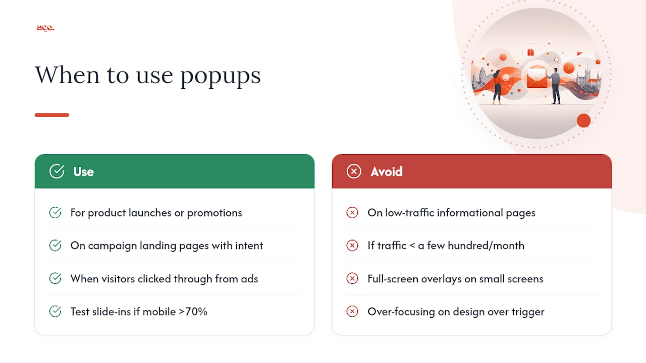
They earn less trust on low-traffic informational pages, or on a site where mobile visitors make up the majority and screen space is already tight. A rough rubric: if your traffic is under a few hundred visitors a month, spend your time on the offer and the page itself before worrying about a popup. If mobile makes up more than 70% of your traffic, test slide-ins before full-screen overlays, since a poorly sized overlay on a small screen does more harm than a missed signup ever would.
My honest read, based on the patterns above, is that most sites overthink the design and underthink the trigger. A beautifully designed popup firing at the wrong moment will always lose to a plain one firing at the right moment.
— Gabbi
Get a GDPR-ready site with popups live in a day
For UK small businesses, a practical alternative exists to briefing an agency and waiting weeks for a popup to go live: pick a template, add your offer, and have it built and compliant the same day, with no separate developer cost. The built-in popup builder includes welcome, exit-intent, and slide-in patterns, paired with GDPR-ready forms so you're not writing consent wording from scratch.
Every aceSites plan includes the full feature set needed to run popups alongside your existing contact forms and booking widgets, not as a bolted-on extra. If you'd rather see it working before committing, browse the live sites in the aceSites portfolio for examples of popups already deployed on real small business sites. And if you'd like the whole thing handled for you, from popup copy to layout, the done-for-you build option sets it up on your behalf. Start with the AI website builder to see your site, and your first popup, built in under a minute.
Sources
- Gamified popups and incentives that lift signups
- Popup statistics and performance patterns
- Newsletter dialog example (minimal design)