
Use WebP for most images on your website. It shrinks file sizes without a visible drop in quality, and smaller files mean faster page loads. Here's your quick start:
- Convert a handful of representative images with a tool like Squoosh or
cwebp. - Serve them with a
<picture>element or let your server handle the switch automatically. - Run Lighthouse before and after to confirm the win.
WebP files typically run 25–35% smaller than equivalent JPEG or PNG files, and that gap is what makes this worth doing.
Key Takeaways
WebP reduces image file sizes by roughly 25 to 35% compared with JPEG and PNG, which directly improves page load speed and Core Web Vitals scores.
| Point | Details |
|---|---|
| Convert with the right tool | Use cwebp, ImageMagick, Sharp or Squoosh depending on whether you need one-off or batch conversion. |
| Always include a fallback | Serve WebP through the <picture> element or Accept header negotiation so older clients still see an image. |
| Match quality to content | Use lossy compression around 70 to 85 for photos and lossless WebP for graphics with sharp edges or transparency. |
| Measure before and after | Run Lighthouse and WebPageTest on real pages to confirm LCP and payload actually improved. |
| Let aceSites handle it | aceSites builds automatic image optimisation into every site, removing the need to manage conversion and serving yourself. |
Table of Contents
- What is WebP and why does it matter for your website?
- Which browsers support WebP images?
- How do you convert images to WebP?
- How do you serve WebP images on your website?
- How do you choose the right size and quality settings?
- Can WebP replace GIF and PNG for animation and transparency?
- How do you measure whether WebP actually improved your site?
- What are the common problems when switching to WebP?
- What are some quick commands you can copy and use?
- Does WebP affect accessibility or SEO?
- When is WebP not the right choice?
- What do the numbers actually show?
- Where should you focus your optimisation effort first?
- How does aceSites handle image optimisation for you?
- Where can you learn more about WebP?
- Sources
What is WebP and why does it matter for your website?
WebP is an image format built for the web, and it does something JPEG, PNG and GIF never managed together: one file type that handles photos, transparency and animation. That versatility is the whole point.
It supports both lossy compression (like JPEG, where you trade a little detail for a much smaller file) and lossless compression (like PNG, where nothing is discarded). It also handles an alpha channel for transparency and can store animated sequences, replacing the job GIF used to do badly.
The headline benefit is size. WebP images typically come in 25 to 35% smaller than comparable JPEG or PNG files, with no visible loss in quality at sensible settings. On an image-heavy page, that difference adds up fast, particularly on mobile connections where every kilobyte costs time.
The tooling behind it is mature rather than experimental. Google maintains libwebp, the reference library, along with command-line tools like cwebp and dwebp for converting and decoding files. Most major editors and build tools now support it natively:
- Adobe Photoshop (WebP export since recent versions)
- GIMP (built-in WebP support)
- Node.js libraries such as Sharp for automated pipelines
- Cloud image services like Cloudinary for on-the-fly conversion
None of this is bleeding-edge. It's a decade-old format with production-grade support across the board.
Which browsers support WebP images?
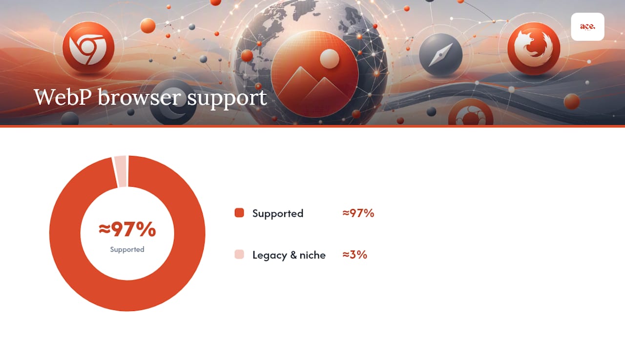
Every major browser in current use renders WebP without a fallback needed. Support sits at roughly 97% of global web traffic, which covers Chrome, Firefox, Safari, Edge and their mobile equivalents.
The remaining few percent tends to be older browser versions or niche software that scrapes or previews images, not real visitor traffic on a modern consumer device. That's still worth planning for if your analytics show any legacy usage.
| Approach | Best for | How it works |
|---|---|---|
HTML <picture> element | Most sites, simple to implement | Lists a WebP <source> first, falls back to JPEG/PNG <img> automatically |
| Server/CDN Accept negotiation | Larger sites, CMS-driven content | Server reads the browser's Accept header and serves WebP only to clients that support it |
| Keep originals only | Print workflows, editorial pipelines, legacy CMS | Avoids compatibility issues where WebP isn't accepted downstream |
The <picture> element is the safest default because it needs no server configuration and degrades gracefully. Accept header negotiation is smoother once set up, but it depends on your hosting stack supporting it correctly, and Web recommends testing the actual response headers rather than assuming it works.
Pro Tip: If you print product photos, export brochures, or feed images into third-party editorial tools, keep a JPEG or PNG master file on hand. Some print workflows still choke on WebP.
How do you convert images to WebP?
The right tool depends on how many images you're dealing with and whether this needs to happen once or continuously.
For command-line conversion, cwebp from Google's libwebp toolkit is the standard choice. A basic command looks like this:
cwebp -q 80 photo.jpg -o photo.webp
The -q flag sets quality from 0 to 100. Most photographs hold up well at 75 to 85, while graphics with flat colours can go lower without visible degradation.
For bulk jobs and build pipelines, a few tools cover most needs:
- ImageMagick handles batch conversion and format scripting well, and it's already installed on many servers.
- Sharp (Node.js) is the go-to for developers automating image resizing and WebP output as part of a build step.
- Imagemin with its WebP plugin slots into existing JavaScript build tools like Webpack or Gulp.
For quick, one-off jobs, browser-based tools do the job without installing anything. Squoosh, built by the Google Chrome team, lets you drag an image in, compare compression settings side by side, and download the result. Online converters process images locally in the browser or on a remote server, which is fine for testing a handful of files but not something you'd want running your entire product catalogue through.
Pro Tip: Don't convert your whole media library in one pass without checking a sample first. Run five or six representative images through your chosen quality setting and eyeball them at full size before committing to a batch job.
How do you serve WebP images on your website?
Converting the files is half the job. Serving them correctly to the right browsers is what actually delivers the speed benefit.
The most reliable client-side pattern is the <picture> element with a fallback:
<picture>
  <source srcset="hero.webp" type="image/webp">
  <img src="hero.jpg" alt="Team fitting a new boiler">
</picture>
Browsers that support WebP load the <source>, everything else falls back to the <img>. Add srcset with multiple widths inside the <source> tag to serve responsive sizes alongside the format switch.
Server-side, many hosting setups can rewrite requests automatically based on the Accept header the browser sends, serving a .webp file where one exists without touching your markup at all. This is tidier at scale but needs proper configuration, and web.dev recommends checking your server actually sends the correct Content-Type: image/webp header rather than assuming it.
CDNs add a third option: automatic on-the-fly conversion, where you upload originals and the CDN generates WebP variants per request based on the visiting browser. Cloudinary is a well-known example of this model. It saves you from managing conversion pipelines yourself, though you'll want to check cache invalidation rules so visitors don't get served a stale image after an update.
- Use
<picture>for simplicity and full control. - Use server rewrites or CDN conversion for scale and less manual upkeep.
- Always verify the actual HTTP headers, not just visual results, when testing.
Pro Tip: Check your Content-Type headers with your browser's network tab. A WebP file served with the wrong header can cause silent rendering issues in some browsers, and it's an easy thing to miss.
How do you choose the right size and quality settings?
Responsive images and sensible quality settings do more for perceived speed than format choice alone — see this small business website checklist for practical priorities that include image optimisation. A perfectly compressed WebP file still loads slowly if it's twice the resolution the layout needs.

Use srcset to offer several widths and let the browser pick, guided by a sizes attribute that matches your actual layout breakpoints:
<img srcset="photo-400.webp 400w, photo-800.webp 800w, photo-1200.webp 1200w"
     sizes="(max-width: 600px) 100vw, 50vw"
     src="photo-800.webp" alt="Salon interior">
- Photographs generally hold up well at quality settings between 70 and 85.
- Illustrations or graphics with sharp edges and flat colour often benefit from lossless WebP instead, since lossy compression can introduce visible artefacts around hard lines.
- Icons and logos with transparency are usually better served lossless too.
- Build pipelines using Sharp or ImageMagick can generate several widths automatically each time you upload an image, rather than resizing by hand.
Pro Tip: Set up automated resizing once and forget it. Manually creating three or four sizes for every image you upload is the kind of task that gets skipped under deadline pressure, which quietly undoes your optimisation work over time.
Can WebP replace GIF and PNG for animation and transparency?
Yes, in most cases. Animated WebP files are typically much smaller than the equivalent GIF at similar visual quality, since GIF's colour palette limitations force larger files to avoid banding. WebP compresses each frame more efficiently and supports full colour depth.
For transparency, WebP's alpha channel does the same job as PNG but at a noticeably smaller file size, which matters for logos, icons and any graphic overlaid on varying backgrounds.
- Animated WebP works well for short product demos, loading indicators, or lightweight motion graphics.
- Transparent WebP suits logos, icons and UI elements previously saved as PNG.
- A small number of older tools and email clients still don't render animated or transparent WebP correctly, so test your specific use case before rolling it out site-wide.
How do you measure whether WebP actually improved your site?
Run Lighthouse and WebPageTest before and after switching formats, on the same page, ideally with caching cleared so you're comparing genuine payloads rather than cached results.
Focus on Largest Contentful Paint (LCP) and total page weight. If your hero image or main product photo drives LCP, that's the single most important image to optimise first, and the one most likely to show a measurable improvement.
- Test on a representative page, not just your fastest or lightest one.
- Compare field data over time using Chrome UX Report or your own real user monitoring, since lab tests like Lighthouse only show a single simulated visit.
- Check that caching headers haven't gone stale after deployment. A common regression is visitors seeing an old cached version and reporting no change.
- Watch for broken images. A rewrite rule or CDN misconfiguration can silently serve a 404 in place of a WebP file, which tanks both speed and user trust.
Pro Tip: Test your actual homepage hero image and your busiest product page, not a random sample. Averages across a whole media library hide the images that matter most for perceived speed.
What are the common problems when switching to WebP?
A few recurring issues catch developers out during the switch, and most have simple fixes.
- CMS thumbnails break. Some older plugins or admin previews expect JPEG or PNG and won't render a WebP thumbnail correctly. Check your CMS's media library after conversion.
- Metadata and colour profiles shift. Converting to WebP can strip EXIF data and, if you're not careful with your conversion settings, alter colour profiles. Preserve ICC colour profiles explicitly during conversion if colour accuracy matters, particularly for product photography.
- Print and export workflows fail. Some design and print pipelines still don't accept WebP as an input format, so keep original files for anything heading to print.
What are some quick commands you can copy and use?
Convert a single image with cwebp, adjusting quality as needed:
cwebp -q 80 image.jpg -o image.webp
Batch convert a folder with ImageMagick:
magick mogrify -format webp -quality 80 *.jpg
A basic Sharp pipeline in Node.js for automated resizing and conversion:
const sharp = require('sharp');
sharp('input.jpg')
  .resize(800)
  .webp({ quality: 80 })
  .toFile('output.webp');
An example Nginx rewrite pattern for Accept-header negotiation, serving WebP only when the browser supports it and a matching file exists on disk, otherwise falling through to the original.
- Test each command on a copy of your files first.
- Keep quality flags consistent across your batch job so results stay predictable.
- Confirm output file sizes actually dropped before deploying at scale.
Does WebP affect accessibility or SEO?
Alt text works exactly the same on WebP as it does on any other format. Screen readers rely on the alt attribute, not the underlying file type, so switching formats changes nothing for assistive technology as long as you keep writing descriptive alt text.
For search engines, smaller images support better Core Web Vitals scores, particularly LCP, which factors into Google's page experience signals. If you rely on image search traffic, make sure your sitemap references canonical URLs and that indexed images resolve correctly rather than pointing to broken WebP paths.
When is WebP not the right choice?
A photo gallery, a screenshot-heavy tutorial page, or a logo with transparency all see genuine savings from WebP, often visible the moment you compare file sizes side by side.
WebP isn't always the answer, though:
- Legacy print production pipelines that expect TIFF, JPEG or PNG as input.
- Some older CMS plugins or third-party embeds that don't parse WebP correctly.
- Strict editorial workflows where original, uncompressed masters need to stay in a specific format for archival reasons.
For the handful of visitors or systems that can't read WebP, the <picture> element fallback covers you without extra effort.
What do the numbers actually show?
The consistent figure across benchmarking sources is a 25 to 35% file-size reduction versus equivalent JPEG or PNG files.
Smaller image payloads reduce Largest Contentful Paint because the browser spends less time downloading and decoding the file that's usually the biggest element on the page.
Pro Tip: *Measure your own hero image and product photos rather than trusting an average.
Where should you focus your optimisation effort first?
Most of the client sites we look at have the same pattern: one enormous hero image on the homepage doing more damage to load time than every other image on the site combined. That's usually the first fix, and often the only one that moves the needle on Lighthouse scores.
After the homepage, product galleries and service pages with multiple large photos are next in line. If you're running a photographer's portfolio or a gallery-heavy site, this is where quality settings deserve the most attention, since visual fidelity matters more there than almost anywhere else on the site.
How does aceSites handle image optimisation for you?
Converting and serving WebP correctly takes real setup work if you're managing it yourself, from choosing quality settings to configuring server headers and testing fallbacks across browsers. aceSites removes that work entirely by handling image optimisation as part of the platform, so your photos load fast without you touching a command line.

Every site built on aceSites includes automatic image handling designed to keep pages fast without manual conversion, alongside built-in SEO tools and a blog manager that cover the rest of your site's performance groundwork. If you'd rather not manage conversion pipelines, quality settings and CDN configuration yourself, the done for you website service builds your site with optimisation handled from day one, and you don't pay until you've seen it live. For a full look at what's included, check the aceSites features page and see how image performance fits alongside everything else your site needs.
Where can you learn more about WebP?
For technical specifications and downloadable tools, Google's WebP developer documentation covers the format and libwebp command-line utilities in full. For implementation patterns like the <picture> element and server negotiation, web.dev's WebP guide is the clearest practical walkthrough. If you need to open or convert a WebP file back to JPEG or PNG without installing software, browser-based converters cover that use case reliably.
Sources
- Pros and cons of WebP images — Tinify (2026 update)
- Web
- An image format for the Web | WebP | Google for Developers