
Stick to name, email and message as your default setup, and only add another field if your team will genuinely act on that answer within seven days. Anything you can't use quickly is just friction stopping someone getting in touch. Keep it mobile-friendly, put a short privacy line near the submit button, and you've covered the basics most businesses ever need.
TL;DR:
- Use only name, email, and message fields for most small business contact forms to maximize submissions and reduce user friction.
- Add only qualifying or optional fields if immediate action can be taken within seven days; otherwise, gather detailed data later through follow-ups.
- Layout contact forms in a single column with logical order, clear grouping, and specific button text to improve mobile usability and completion rates.
- Implement input types, validation, accessible labels, and error messages properly to prevent user frustration and increase trust in the form.
- Use conditional logic and multi-step forms to gather relevant information without overwhelming visitors, especially for high-value or complex inquiries.
Table of Contents
- What are the essential contact form fields?
- When should you add qualifying or optional fields?
- How should you lay out a contact form for better completions?
- Getting input types, validation and accessibility right
- Using conditional logic and progressive profiling without adding friction
- Ready-to-use contact form templates you can copy
- Implementing forms quickly and staying GDPR-compliant
- A launch-ready checklist before you publish your form
- Build and test your contact form faster with aceSites
- Sources
What are the essential contact form fields?
Three fields do the job for most businesses: name, email address, and message. Everything beyond that is a decision, not a default.
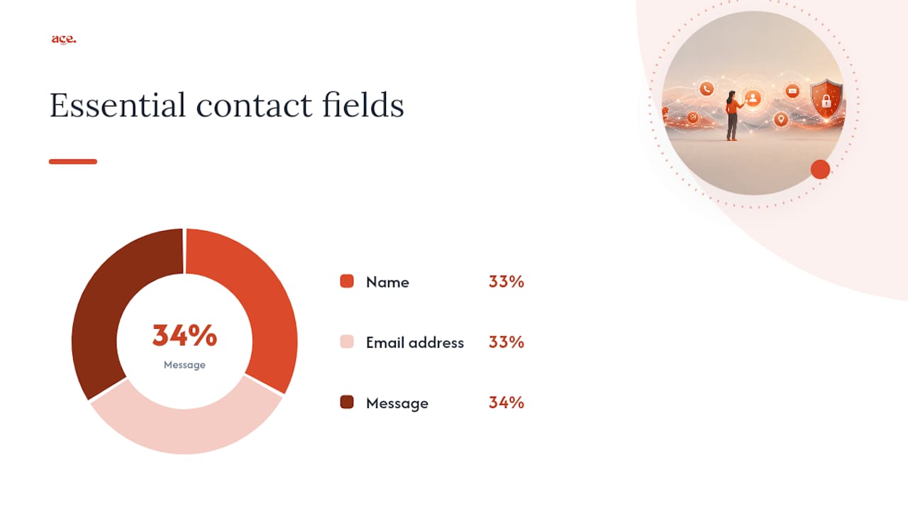
That's not a lazy shortcut. Cutting a contact form down from 11 fields to 4 can lift submissions by roughly 120%, because every extra field is one more reason for someone to give up halfway through. If you're building a form for a plumber, a hairdresser, or any service business where the goal is simply "get the phone to ring," fewer fields wins almost every time.
Here's how to handle each one properly:
- Name. Use a single "full name" field unless your team genuinely needs first and last name split for a CRM or a personalised reply ("Hi Sarah" reads better than "Hi Sarah Thompson"). One field is faster to fill and just as useful for most small businesses.
- Email address. Always required. Use
type="email"so mobile keyboards show the @ symbol automatically and browsers can validate the format and offer autofill. A placeholder like "you@example.com" tells people exactly what's expected without cluttering the label. - Message. Give this a proper textarea, not a single-line input, with a hint such as "Tell us what you need and we'll get back to you within one working day." That one sentence does two jobs: it sets expectations and nudges people to actually write something useful instead of "Hi, call me."
- Subject line — optional, and honestly skippable for most small business forms. If you run several services, a dropdown ("Enquiry type") does the same job with less typing.
- Phone number — optional by default. Some visitors would rather text or call than wait for an email reply, so offer it, but don't force it. Templates generally advise against making phone required, since it's one of the biggest drop-off points on mobile.
- File upload — only add this if people genuinely need to send something, like a support ticket screenshot or a floor plan for a quote. It adds visible complexity, so keep it hidden unless the enquiry type calls for it.
The pattern here is simple: every field should either be required because you can't function without it, or optional because it's genuinely helpful rather than habitual. Name, email, and message make the "required" cut on nearly every business form. Everything else earns its place, or it gets cut.
When should you add qualifying or optional fields?
Every extra field costs you completions. So before adding one, run it through a simple test: will this data actually change what your team does in the next seven days?
That's the core of the seven-day data-use test, a practical rule for auditing form fields: if you won't act on an answer within a week, don't ask for it upfront. Fields you're not going to use quickly are better handled later, through a follow-up call or a CRM enrichment tool that fills in company size or industry automatically.
Work through it like this:
- List every field you're considering, including the "nice to have" ones your sales team asked for six months ago.
- Ask what happens to each answer within seven days. If nobody looks at "How did you hear about us?" until the quarterly report, it doesn't belong on the form.
- Decide your priority: volume or quality. A general enquiry form for a local business should chase volume, so keep it to three or four fields. A B2B sales form justifies more qualification because each lead is worth more time.
- Replace free text with bounded choices wherever you can. A dropdown for "Budget range" takes two seconds to tap; a text box asking the same question takes thirty seconds to type and produces messier data.
Pro Tip: If you're torn on whether to include a field, add it as optional first and check your form analytics after a month. If barely anyone fills it in, or your team never reads the answers, remove it. That's a faster, more honest test than debating it in a meeting.
Qualification fields make sense when the cost of a bad-fit lead is high, think consultancy work, high-ticket sales, or anything with a long onboarding process. For a local trades business or a shop, that overhead usually isn't worth it. The enquiry itself is the qualification; you'll sort out fit on the phone.
How should you lay out a contact form for better completions?
A single-column layout beats a multi-column one nearly every time, especially on mobile, where the majority of contact form traffic now lands. Two columns force the eye to jump around and make error messages harder to spot; one column reads top to bottom the way people naturally scan a page.
Tap targets matter more than most people realise. Buttons and input fields should be at least 44 pixels tall on mobile, roughly the size of a fingertip, or you'll get frustrated taps that miss the field entirely. This is one of the quiet reasons mobile-first, single-column layouts consistently outperform desktop-style grids squeezed onto a phone screen.
Beyond layout, a few small choices carry a lot of weight:
- Order fields logically. Name, then email, then message. Don't scatter an optional phone number between two required fields; it breaks the reader's rhythm and adds a decision point mid-form.
- Group related items visually, using spacing rather than borders, so the form reads as a handful of natural steps rather than a wall of boxes.
- Write specific button copy. "Send Message" is fine, but "Get My Free Quote" or "Ask a Question" tells the visitor exactly what happens next and tends to outperform a generic "Submit."
- Set expectations after submission. A confirmation message like "Thanks, we'll reply within one working day" reduces the anxious "did that even work?" refresh, and cuts down on duplicate submissions.
- Add a one-line privacy note near the button. Something like "We'll only use your details to reply to your enquiry" builds trust without needing a full legal page open in a new tab.
Shorter, cleaner forms with correct mobile sizing are one of the most consistent levers for lifting submissions, and the 4-field version mentioned earlier is the clearest proof of that: the same enquiry, asked with less effort, gets more people to finish it.
Getting input types, validation and accessibility right
Small implementation mistakes quietly cost you submissions, mostly because they annoy people just enough to make them close the tab. The fix is usually a one-line code change, not a redesign.
Start with input types. Using type="email" triggers the @ symbol on mobile keyboards; type="tel" brings up the numeric keypad; type="url" adds the slash and .com shortcuts. These aren't cosmetic touches. The correct HTML5 input types genuinely change what keyboard someone sees, and a numeric keypad for a phone number removes friction most designers never think to test for.
A few more things worth getting right the first time:
- Validate on blur or on submit, not on every keystroke. Flagging an email as "invalid" while someone's still halfway through typing it feels punitive and makes people distrust the form.
- Write fixable error messages. "Please enter a valid email address" is useful; "Error" is not. Tell people what's wrong and, ideally, where.
- Keep labels visible above the field, not just inside it as a placeholder. Placeholder text disappears the moment someone starts typing, so if that's the only label, people forget what the field was for.
- Give error messages an ARIA relationship to their field, so screen readers announce the problem next to the input it belongs to rather than as a disconnected message at the top of the page.
- Check the tab order. Keyboard users should move through the form in the same order a sighted user reads it, top to bottom, left to right.
These are the kind of details that separate a form that feels trustworthy from one that feels like it was bolted together in an afternoon. None of them are difficult; they just require someone to actually tab through the form once before it goes live.
Using conditional logic and progressive profiling without adding friction
You don't have to choose between a short form and rich data. Conditional logic lets you show extra fields only when they're relevant, so the form stays short for most visitors but still gathers detail from the ones who need it.
- Branch based on an early answer. If someone selects "Business enquiry" from a dropdown, reveal a "Company size" field underneath it. Someone selecting "General question" never sees it. This keeps the form short by default and specific where it needs to be, a pattern most modern form templates and builders now support out of the box.
- Split genuinely long forms into 2 or 3 steps with a visible progress indicator. "Step 1 of 3" reassures people there's an end in sight, which matters far more for a ten-field sales qualification form than a three-field contact form.
- Use progressive profiling for returning visitors. Rather than asking a returning customer for everything again, ask for one new piece of information each visit, an industry the first time, a budget range the next. Over several visits you build a fuller picture without ever presenting a long form.
The common thread is that friction is felt at the moment of asking, not at the total amount collected. A form that asks three easy questions today and one more next month feels lighter than a form that asks four questions all at once, even though the end result is the same amount of information.
Ready-to-use contact form templates you can copy
Most businesses only need one of three form types. Pick the one that matches the enquiry, adapt the field names to your own wording, and you're ready to publish.
- General enquiry works for most local service businesses, tradespeople, and shops where the goal is simply getting a conversation started.
- Sales or demo suits anyone qualifying leads before a call, agencies, consultants, software vendors.
- Support fits any business that already has customers and needs to route existing account issues rather than fresh enquiries.
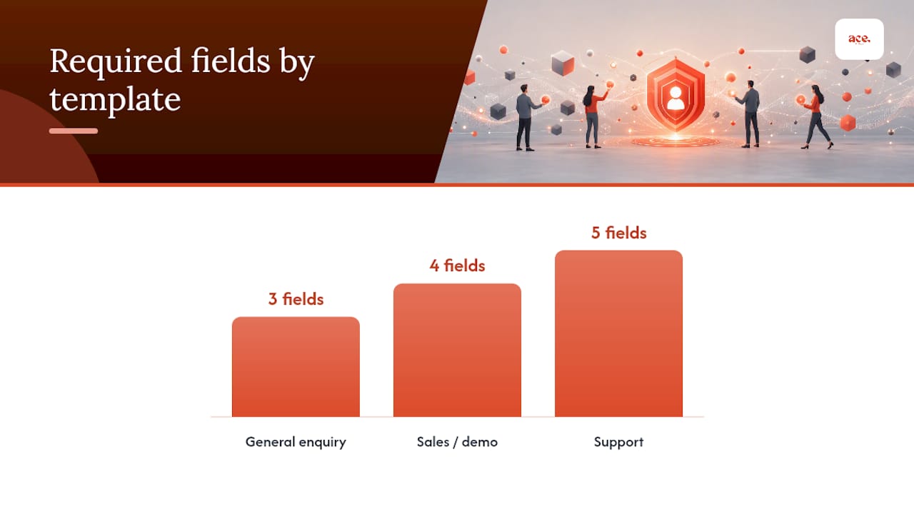
| Template | Required fields | Optional fields | Conditional fields |
|---|---|---|---|
| General enquiry | Name, email, message | Enquiry category | None |
| Sales / demo | Name, company, email, message | Phone | Budget or timeline dropdown (shown after company field) |
| Support | Name, email, account ID, issue type, message | Attachment | None |
The general enquiry template is deliberately bare. It matches the 3 to 5 field sweet spot most guides recommend for lead-generation forms, and it's the version most small business websites should default to.
The sales template earns its extra fields because the data justifies it: knowing a rough budget or timeline before a call saves a sales conversation from being a fact-finding mission. Making that field conditional, only appearing once someone's filled in company details, keeps the form from feeling like an interrogation from the first field.
The support template swaps "message" quality for identification speed. An account ID and issue type dropdown let a support team route the ticket correctly the moment it lands, which matters more here than it does on a general enquiry form. An optional attachment covers screenshots or error logs without forcing everyone to find one.
Implementing forms quickly and staying GDPR-compliant
Getting these fields right is one part of the job. Getting them live, with the right wording and legal cover, is the other, and that's usually where small business owners lose the most time.
Many website platforms include contact forms as a built-in feature, allowing you to choose field types and write microcopy without wiring up a form handler from scratch. A few things worth checking as you set yours up:
- Use GDPR-compliant contact form wording rather than writing your own data-use notice from memory; it's easy to miss a required line.
- Check your form's privacy link points to a proper privacy policy page, not just a placeholder.
- Look at live examples in the aceSites portfolio to see how real service businesses have field choices and layout working in practice.
- Run your finished form past a basic accessibility checklist before you publish, covering labels, focus order, and error handling.
None of this requires a developer. It just requires checking the boxes in order, rather than assuming the default template covers everything your business needs.
A launch-ready checklist before you publish your form
Before any form goes live, I run through the same short checklist, because it's always the small things that get missed under deadline pressure.
Check that the required fields actually match what your team can act on. Load the form on a phone, not just a laptop, and tap through every field yourself. Confirm the privacy line is visible without scrolling and that submissions route to an inbox someone actually checks. Then turn on form analytics from day one, even basic completion-rate tracking, so you're not guessing later.
Once it's live, resist the urge to change five things at once. Test one change, a field removed, a button reworded, and give it a few weeks before judging the result. Contact forms are rarely finished; they're just accurate for now.
— Gabbi
Build and test your contact form faster with aceSites
Ace-sites is the practical alternative to piecing a form together with a plugin and a privacy policy template from three different sites. Some platforms offer contact forms pre-wired, with GDPR-ready wording and mobile-optimised templates that handle layout without additional coding.

If you want to see the fields and layout choices in action before committing to anything, the aceSites feature list covers exactly what's built in, from the form manager to the blog tools that pair with it. Prefer to see it working first? Try the AI website builder and have a working contact form live in under a minute, with sensible defaults already applied. And if you'd rather hand the whole job over, the free website build option means you pay nothing until you've seen the finished site, form included.
Sources
- HTML input — MDN Web Docs
- Too many fields in contact form | OrbitForms
- Contact form design that converts (2026) | Antforms Blog
- Contact form template guide — Formlova