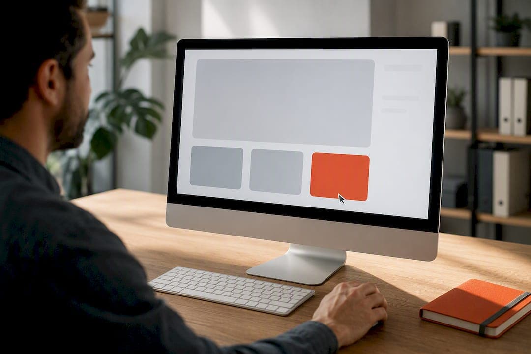
The strongest call to action pairs a specific action verb with a specific benefit, then removes the reader's biggest hesitation with a short line of microcopy underneath. If you only change one thing this week, swap a vague label like "Submit" for something benefit-led like "Get my free quote" and add a friction-reducer such as "No card required" directly below the button. That single tweak often does more than a full redesign.
TL;DR:
- Using benefit-led, first-person CTAs like "Start my free trial" generally outperforms generic or second-person phrasing across different funnel stages.
- Microcopy such as "No card required" or "Takes 2 minutes" significantly increases click-through rates by addressing common objections upfront.
- A single, prominent CTA button with a clear visual hierarchy consistently outperforms multiple competing buttons on a webpage.
- CTAs should match the user's stage in the funnel, with direct language for ready-to-act visitors and softer, exploratory phrasing for early-stage prospects.
- Conducting one-variable A/B tests, especially on microcopy and button design, is essential to optimize conversion rates effectively.
Table of Contents
- What is a call to action, and which formats show up most?
- How do you actually write a call to action that converts?
- Call to action examples by goal and channel
- Why some CTA phrases get clicked and others get ignored
- How to test and measure your CTAs
- Your ready-to-use CTA swipe file
- Building CTAs into real small-business sites
- How Ace-sites helps you put these CTAs into practice
- Sources
What is a call to action, and which formats show up most?
A call to action is the button, link, or line of text that tells someone exactly what to do next, paired with the microcopy and placement around it that make doing it feel easy. It's the button label, the small line underneath, and where you put it on the page, all working as one unit. That last part gets missed constantly: marketers obsess over the four words on the button and forget the sentence sitting right beneath it does half the persuading.
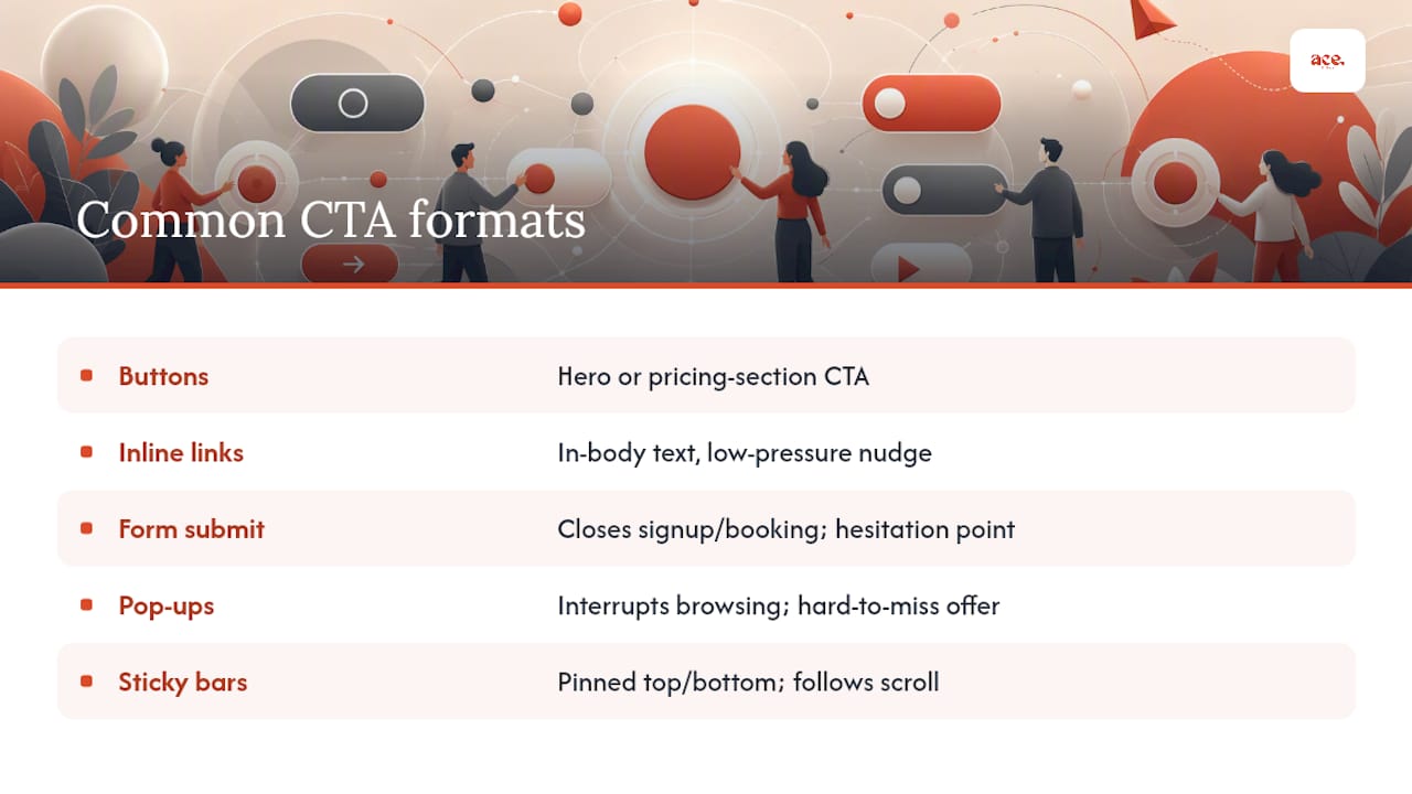
You'll meet CTAs in five main formats. Buttons are the obvious one, usually sitting in a hero section or at the end of a pricing table. Inline links do quieter work inside body text, nudging a reader mid-article towards a related page. Form submit buttons close out a signup or booking flow, often the moment where hesitation peaks. Pop-ups interrupt browsing to make an offer impossible to miss. Sticky bars stay pinned to the top or bottom of the screen, following the reader as they scroll.
Each format sits somewhere in the conversion funnel, and the CTA has to match that position. A sticky bar promoting a seasonal sale drives immediate purchases. An inline link to a guide drives quiet, low-pressure exploration. Get the format wrong for the funnel stage and even a well-written CTA underperforms, because you're asking a first-time visitor to commit like a returning customer.
How do you actually write a call to action that converts?
Most CTAs fail for one of two reasons: they're vague, or they ask for too much without addressing why someone would hesitate. Fixing both is mostly a matter of discipline, not creativity.
Start with a verb that names the outcome, not the mechanism. "Submit" describes what the software does. "Get my free audit" describes what the reader gets. Practitioner guidance on copywriting swaps consistently finds that replacing bland labels with benefit-led phrases lifts conversions, because the reader's brain answers "what's in it for me" before it answers "what does this button do."
Use first-person phrasing when ownership matters. "Start my free trial" tends to outperform "Start your free trial" in tests, because the first-person version has the reader mentally speaking the commitment rather than being told what to do. It's a small shift, but it's one of the easiest A/B tests to run and one of the most reliably positive.
Keep the button text short, but not at the cost of clarity. Two to five words is the sweet spot for most primary CTAs. That said, three to seven words is fine, and sometimes better, when the extra word adds real specificity. "Get the checklist" beats "Get it" because it tells the reader what they're actually receiving.
Add microcopy under the button to answer the objection you know is coming. If price is the worry, "No card required" kills it. If time is the worry, "Takes 2 minutes" kills it. This is not decoration. Microcopy that addresses a real barrier materially improves click rates, and it works because it answers a question the reader was about to ask themselves right before clicking away.
Build a clear visual hierarchy. One primary CTA should dominate the page. Secondary CTAs, like "Learn more" next to "Buy now", need to look secondary: smaller, outlined rather than filled, a muted colour. Practice guidance from Adobe Express on CTA design backs this up directly. A single prominent primary CTA in the hero, repeated at logical decision points down the page, consistently outperforms a page with several equal-weight buttons competing for the same click.
Design for thumbs, not just eyes. A button that looks perfectly clickable on a desktop monitor can be a nightmare to tap on a phone. Buttons need to be keyboard-focusable, carry a descriptive aria-label rather than a generic one, and sit large enough and far enough from other elements to hit reliably with a thumb. Our mobile site optimisation guidance covers this in more depth, and our accessibility checklist is worth running through before any launch.
Use urgency and scarcity, but only when it's true. "Only 3 left" is powerful when it's accurate and hollow when it isn't, and readers spot the difference fast. When you do have a genuine deadline or limited stock, pairing that urgency with social proof (a number of recent buyers, a rating) tends to outperform urgency alone.
Run every CTA through this checklist before it goes live:
- Verb check: Does the button lead with an action word tied to a benefit, not a mechanism?
- Benefit check: Would a stranger know what they're getting, in plain terms, without context?
- Friction check: Is there a line of microcopy addressing the most likely objection?
- Visual check: Is there exactly one primary CTA per screen, with anything else visually secondary?
- Mobile check: Is the tap target large enough, and is the label readable at arm's length on a phone?
Pro Tip: If you're stuck rewriting a CTA, write down the one sentence a hesitant customer would say out loud right before clicking away ("but what if it doesn't fit my budget?"). Your microcopy is the answer to that exact sentence, not a generic reassurance.
Call to action examples by goal and channel
Different goals call for different phrasing, and the same words that work brilliantly on an e-commerce product page can fall flat in an email footer. Organising CTA examples by funnel stage and channel, rather than treating them as interchangeable, is what separates a swipe file that actually gets used from one that gets skimmed and forgotten. Grouping CTAs by TOFU, MOFU, and BOFU stages gives you a useful mental model here: top-of-funnel CTAs invite low-commitment exploration, bottom-of-funnel CTAs ask for the sale.
1. E-commerce product and checkout CTAs
"Buy now" and "Add to basket" remain the standards because shoppers already know what they mean and don't need decoding. "Buy now" suits a single decisive purchase moment, often on a product with limited stock or a strong deal. "Add to basket" fits multi-item shopping, since it doesn't force a commitment yet. A softer alternative, "Add to wishlist", captures interest from browsers who aren't ready to buy, which matters because forcing a purchase decision too early loses that visitor entirely.
- Direct: "Buy now, ships today"
- Soft: "Save for later"
- First-person: "Add it to my basket"
- Microcopy pairing: "Free returns within 30 days" under the checkout button
2. SaaS and subscription CTAs
"Start my free trial" and "Book a demo" split SaaS buyers into two very different groups: people ready to try the product themselves, and people who want a human to walk them through it first. Offering both, with the self-serve option visually primary, respects that split instead of forcing everyone down one path.
- Direct: "Start my free trial"
- Soft: "See how it works"
- First-person: "Book my demo"
- Microcopy pairing: "No credit card required" beneath a trial CTA
3. Lead generation CTAs
"Get the checklist" and "Download the guide" work because they name the exact deliverable rather than the vague action of "downloading". A reader deciding whether to hand over an email address wants to know precisely what lands in their inbox.
- Direct: "Get the checklist"
- Soft: "Send me the guide"
- First-person: "Get my free template"
- Microcopy pairing: "Delivered instantly, no spam"
4. Newsletter and email CTAs
"Send me tips" outperforms a generic "Subscribe" because it tells the reader what kind of relationship they're signing up for. Email CTAs also benefit hugely from specificity about frequency, since "one email a week" reassures far more than an open-ended commitment.
- Direct: "Send me weekly tips"
- Soft: "Keep me posted"
- First-person: "Sign me up"
- Microcopy pairing: "Unsubscribe anytime, one click"
5. Event and booking CTAs
"Reserve my seat" beats "Register" because it implies scarcity and personal stake without needing extra urgency language bolted on. For paid events, pairing the CTA with the price and what's included reduces the number of people who click through only to abandon at checkout.
- Direct: "Reserve my seat"
- Soft: "Save my spot"
- First-person: "Book my place"
- Microcopy pairing: "Limited to 40 attendees"
6. Mobile app CTAs
"Install now" works because it's the exact verb the app store button uses, so there's zero translation gap between the marketing page and the action itself. "Get the app" is a fine softer alternative for readers still deciding between platforms.
- Direct: "Install now"
- Soft: "Get the app"
- First-person: "Get my free app"
- Microcopy pairing: "Free, 4.8 stars, 2 minute setup"
7. Social ad CTAs
"Shop the sale" and "Learn more" cover the two extremes of social intent: people ready to buy right now, and people who clicked out of curiosity and need a softer landing. Real-brand examples of benefit-led CTAs tend to show the highest-performing social ads leading with the specific outcome, not the brand name, because a scrolling thumb stops for a benefit far more reliably than for a logo.
- Direct: "Shop the sale"
- Soft: "Learn more"
- First-person: "Show me the deal"
- Microcopy pairing: "Ends Sunday, while stocks last"
Readers wanting a wider bank of channel-specific examples, particularly for platforms like Instagram, can find useful additional phrasing in this Instagram CTA guide, which breaks down wording that performs well in a fast-scroll environment.
The pattern across every group above holds steady: direct CTAs suit visitors already close to deciding, soft CTAs suit visitors still exploring, and first-person versions are worth testing wherever ownership language might tip a hesitant click into a committed one.
Why some CTA phrases get clicked and others get ignored
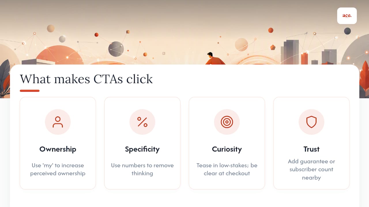
Ownership language changes how committed a reader feels before they've even clicked. "Start my subscription" makes the reader mentally rehearse the action as their own decision, whereas "Start your subscription" keeps them in the position of being instructed. That gap sounds small on paper but shows up reliably in test results, which is why it's one of the cheapest, highest-value tests you can run this month.
Specificity works the same way in reverse: it removes thinking, rather than adding commitment. "Save money" requires the reader to imagine how much, and imagining takes effort most visitors won't spend on a page they're scanning in seconds. Numbers do the cognitive work the reader would otherwise have to do themselves.
Curiosity-gap CTAs, the ones that tease an outcome without revealing it ("See what's inside"), can outperform clarity-first CTAs in exploratory, low-stakes contexts like a blog footer or a social post. But curiosity gaps lose to clarity the moment the stakes rise, particularly at checkout or on a pricing page, where a vague CTA reads as suspicious rather than intriguing. Match the technique to the moment: tease when the ask is small, be direct when the ask is significant.
Trust triggers close the remaining gap for hesitant readers. A guarantee ("30 day money back"), a specific number ("Join 4,000 subscribers"), or a short line of social proof placed near the button all work by lowering perceived risk rather than raising perceived reward. Readers rarely need convincing that your product is good; they need convincing that clicking won't cost them something if they're wrong.
How to test and measure your CTAs
Guesswork has no place in CTA optimisation when testing is this straightforward. A/B testing remains the only definitive way to know whether a CTA change actually helped, because audience preferences vary too much between industries, products, and even individual pages to trust a "best practice" blindly.
- Change one variable at a time. Test the verb, the colour, the microcopy, or the placement, never several at once, unless your traffic volume genuinely supports a multivariate test. With one variable, you know exactly what caused the shift; with several, you're guessing which change did the work.
- Give the test enough time and traffic before reading results. Ending a test early on a lucky day is the single most common mistake in CTA testing. If you're unsure whether a result is real or noise, a statistical-significance calculator will tell you faster than instinct will.
- Track the right metrics, in order. Click-through rate to the next step tells you whether the CTA itself is compelling. Conversion rate on the destination page tells you whether the promise matched the delivery. Downstream value, such as revenue per visitor, tells you whether the "win" actually mattered to the business.
- Act decisively on the result. If a variant wins, make it the new baseline and test your next hypothesis against it. If it loses, revert immediately and test a different variable instead of tweaking the same one repeatedly.
Statistic in focus: Microcopy changes deserve equal billing with button-text changes in your testing roadmap. Testing microcopy as its own independent variable can shift perceived risk enough to produce uplift comparable to changing the main CTA text itself, which is why so many teams that only ever test button colour are leaving easy wins on the table.
Your ready-to-use CTA swipe file
Copy these into your own drafts and adjust the specifics to your offer. They're grouped by intent, not by industry, because the psychology behind each phrase matters more than the vertical it's used in.
To drive an immediate purchase or signup:
- "Buy now, ships today"
- "Start my free trial"
- "Claim my discount"
- "Get instant access"
- "Reserve my seat"
To capture a lead with low commitment:
- "Get the checklist"
- "Send me the guide"
- "Get my free quote"
- "Show me pricing"
- "Get my free audit"
To reduce hesitation at the final step:
- "Complete my order"
- "Confirm my booking"
- "Finish signing up"
- "Get my confirmation"
Softer, exploratory alternatives:
- "See how it works"
- "Learn more"
- "Explore the features"
- "See real examples"
Microcopy to pair underneath:
- "No credit card required"
- "Takes 2 minutes"
- "Free returns within 30 days"
- "Cancel anytime, no questions asked"
Before you publish any of these, run a fast three-point check: does this match what your specific audience already believes and worries about, does the microcopy address their real friction point rather than a generic one, and is this CTA sitting where someone is actually ready to act rather than three scrolls too early?
Pro Tip: Keep a running document of every CTA you've tested and what happened. Six months in, that document becomes more useful than any generic swipe file, because it's built entirely from your own audience's actual behaviour.
Building CTAs into real small-business sites
Watching small-business owners build their first site tells you fast what actually matters in a CTA: not cleverness, but clarity someone can act on in under three seconds. When a site is built, the hero CTA, its microcopy, and the mobile tap target get decided before a single template colour does, because that decision shapes everything else on the page.
A beautician's homepage needs "Book my appointment" sitting where a thumb can hit it without a second attempt, not a beautifully designed button buried below three paragraphs of history. The built-in SEO tools and blog manager exist precisely so that once someone lands on the page, the CTA has actually earned its place: the content around it answered a real question first.
Readers wanting to see this in practice sooner rather than later can test it directly against their own business idea, which the next section covers.
— Gabbi
How Ace-sites helps you put these CTAs into practice
Ace-sites is the faster route to a converting website when you don't have weeks to hand-code buttons, test tap targets, and tweak microcopy yourself. Every template comes with a hero CTA, pop-up builder, and announcement bar already positioned according to the placement rules covered above, so the primary action on your homepage is decided for you, not left as an afterthought once the design is "finished."
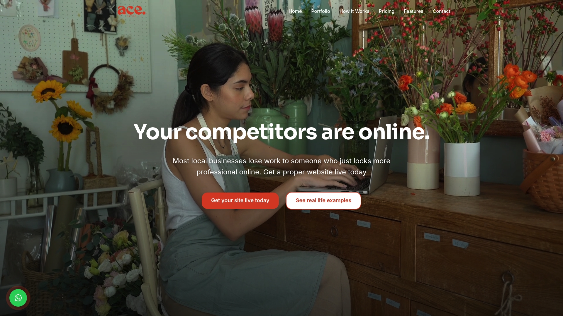
The built-in SEO tools and blog manager mean the content sitting above your CTA is doing real work too, giving visitors a reason to trust the button before they click it. Booking widget embeds and contact forms are already built to be mobile-friendly and accessible, so you're not troubleshooting a broken tap target the night before launch. If you want to see how quickly a CTA-ready homepage comes together, try the AI website builder and have a working draft in minutes, or look through the done-for-you build option if you'd rather hand the whole thing over and review it once it's live.
Sources
- 19+ Call-To-Action Examples + Tips To Boost Clicks / Figma
- Copywriting tweaks to boost conversions / WordStream